KIA - logo redesign case study

KIA - logo design case study
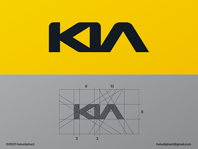
This KIA word mark design concept is based on the meaning of the name and designed with the Fibonacci numbers as a guide for the proportions.
According to the company, the name "Kia" derives from the Sino-Korean characters 起 (ki, 'to arise') and 亞 (a, which stands for 亞細亞, meaning 'Asia'); it is roughly translated as "Rising from (East) Asia."
To incorporate the meaning of the name into the design, I chose to connect the letters "K" and "I", to create a triangle shape in the negative space. This triangle or arrow points to the left coming from the right, which now represents the arising from the East/Asia.
About the readability issue of the current KIA logo:
I solved this issue simply by changing the angle of the "A", while still connected to the "I". Both letters look off from each other and are therefore not easily misread as "N".