Mandarin Brand Identity Design


Mandarin Brand Identity Design
About the company:
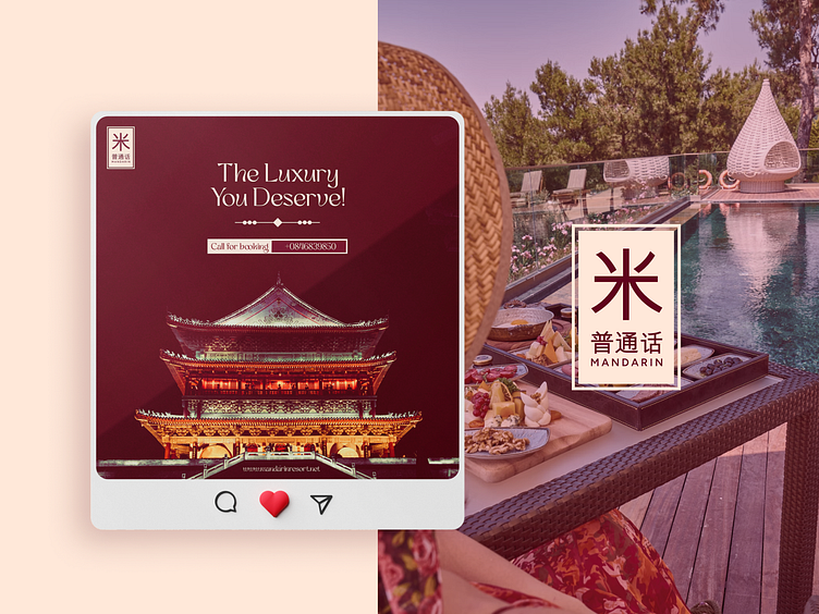
Mandarin is a luxury resort located in China. They offer very luxurious services to their customers. It is one of the most affordable and yet very luxurious resorts for tourists
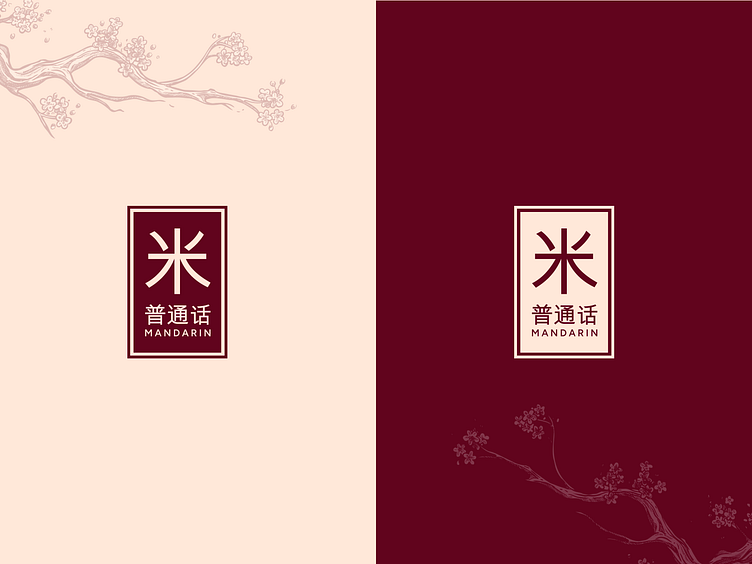
About the logo:
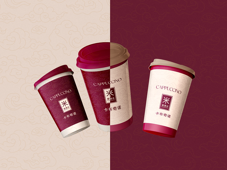
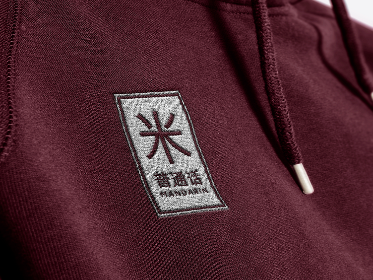
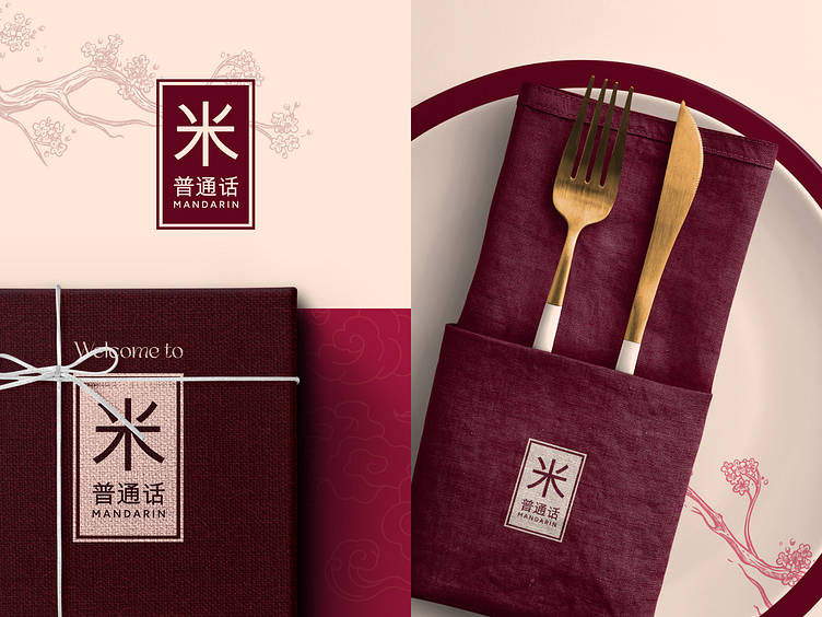
The client desired a simple yet powerful logo. which also represents luxury also. So we decided to use the color Dark red to portray a luxurious vibe in it and the logo mark is the letter M in Chinese. That way we kept the logo simple yet luxurious.
Challenges:
For Mandarin, our main challenge was to think about how to make a logo that is minimal yet impactful and luxurious at the same time.
Solutions:
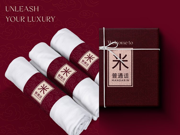
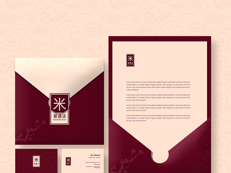
We created comprehensive branding with an intriguing visual design and messaging/positioning plan following intensive research, workshops, and proposals. To explain Mandarin's value proposition to clients, investors, and the media, we condensed it into a concise statement. Then, we developed brand guidelines.
Have project in mind
visit ofspace.co
Ofspace Design
⭐️⭐️⭐️⭐️⭐️ A 5-star rated agency on GrabStar
.
🔥 We will provide a quick analysis and a free proposal for it.
Don’t worry, it is secure and confidential.
.
✉️ Available for your long-term or short-term partnership 👋🏻 [email protected]
.
🌎 Follow us on Instagram | Facebook | Behance