Wikipedia redesign
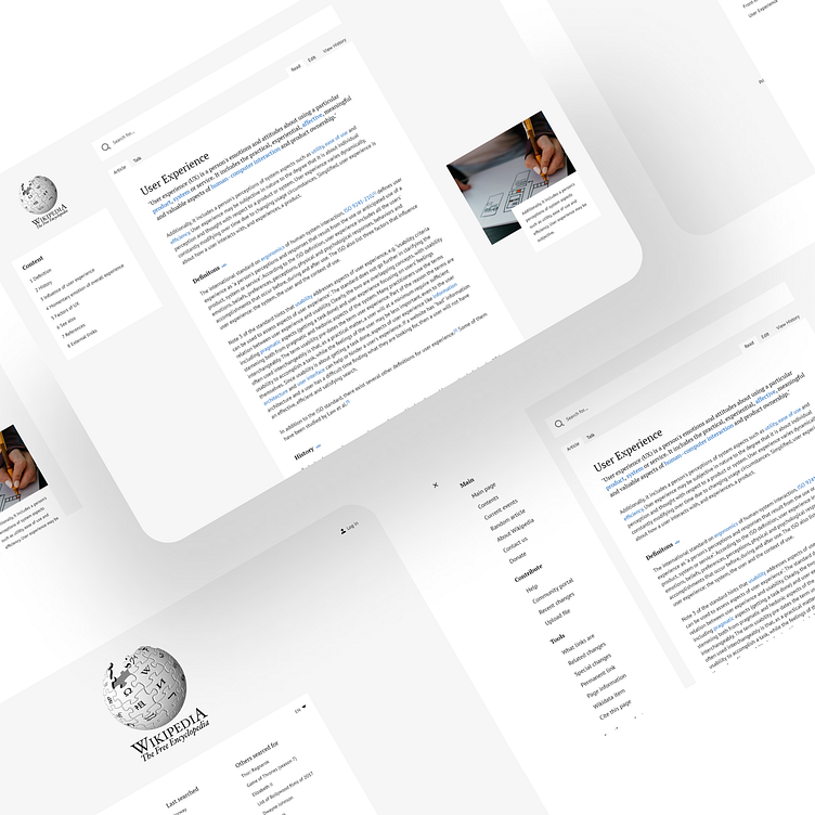
When you first enter the focus is on the logo and searchbar. From here you can easy and fast search for wanted information.
There can also be articles tailored to your liking or just popular articles under the searchbar.
When clicking search you will get popular search words, last searched and what others have searched for.
The content menu has been moved to the left side of the page instead of being a part of the article. It will follow you as you scroll and light up showing you were in the article you are.
Search is clear and visible at the top to be easily identified. Text has a max width of 800 to be easily readable.
Instead of the sidebar always being open and taking up a part of the screen as it is today. It is here locked away behind a burger menu icon in the top left.
As you keep typing the search wil suggest results.


