HCS - New branding design for a service company

New brand language
The project we are kicking off is for a sales team called “The Home and Consumer Services” also known as “HCS”.
Outcrowd team assisted with a full branding redesign which is a part of the new brand language of the company.
The company's new language includes a new mission statement, vision statement, and team values that are inclusive to everyone on the team and every type of business we work with.
The mission for our team was to reveal exactly these NEW changes in the visual identity of the brand.
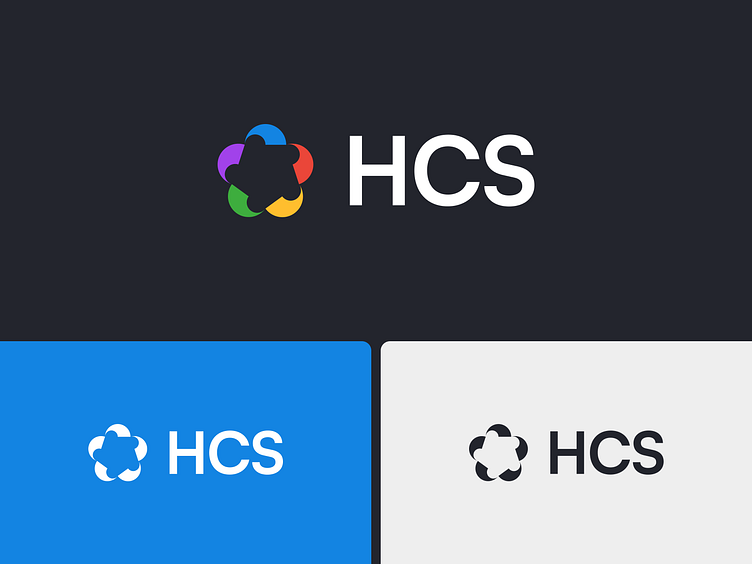
New Logo Design
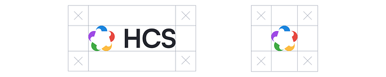
The logo depicts a kind of cloud as a reflection of a dream, the white space in the center looks like a flower - a cherished goal.
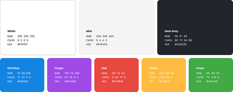
At the same time, each part of the logo reflects the team and 5 sides of the company's services, and each of them has a separate color:
For example:
Real Estate: Blue (loyalty, feel good, family)
Auto: Red (fast cars)
Home Services: Yellow (sunshine)
Home Security: Purple (safety)
Green: Coupons (money/savings)
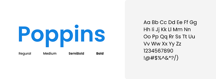
Typography
The font we chose reflects the contrasting nature of the brand - straight and strict lines reflect the trust and seriousness of the company, and rounded shapes are positive and humanistic.