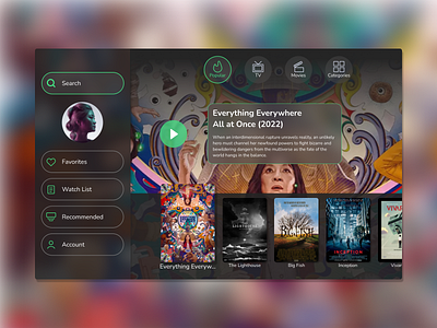
Daily UI 100 Day Challenge - DAY 025 "TV App"
Sometimes I find myself scrolling through rows and rows of suggested movies and shows until I get to my current watch list. I would like to reduce that so I put the Favorites, Watch List, and Recommended categories in the left navigation drawer. This drawer might collapse with just the icons and then expand when the selection cursor is moved over to that side. I also like the idea of a single row of suggested movies and shows instead of the seemingly infinite scrolling you get with current TV apps.
Tools: Figma
More by Jedd Dill View profile
Like
