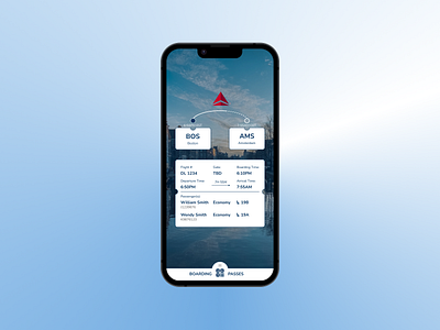
Daily UI 100 Day Challenge - DAY 024 "Boarding Pass"
I already designed a receipt for this "flight" so why not design a boarding pass for it! I know that these days I only use mobile boarding passes for flights, so I chose to do a mobile design. I made sure to use typography to indicate the most important information in a clear and concise fashion. I also made the decision to make the boarding passes accessible by a bottom drawer. I am envisioning a nice full screen transition animation when you pull the drawer up to reveal your QR boarding pass.
Tools: Figma
More by Jedd Dill View profile
Like
