Find designers
Designer search
Quickly find your next designer
Post a job
The #1 job board for design talent
Inspiration
Courses
UX Diploma
Learn UX design from scratch in 6 months
UI Certificate
12-week UI skill building for designers
Live interactive workshops
with design professionals
Jobs
Go Pro
Log in
Dribbble: the community for graphic design
Log in
Sign up
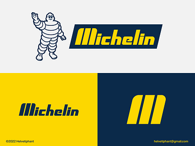
Michelin - logo redesign
Helvetiphant™
Available for work
Follow
Following
Like
Get in touch
The concept is based on the letter M resembling a tire and all letters have been made from scratch.
abstract logo
automotive industry
brand design
branding
custom letter logo
icon
lettermark logo
letter m logo
logo
logo design
logo designer
logo redesign proposal
logotype
mark
michelin
minimalist logo
mobility
modern logo
tire manufacturer
typography
View all tags
Posted on Nov 26, 2022
8,894
0
57
6
View feedback
Helvetiphant™
Get in touch
More by Helvetiphant™
View profile
Previous
Next
Loading…
Loading…
Loading…