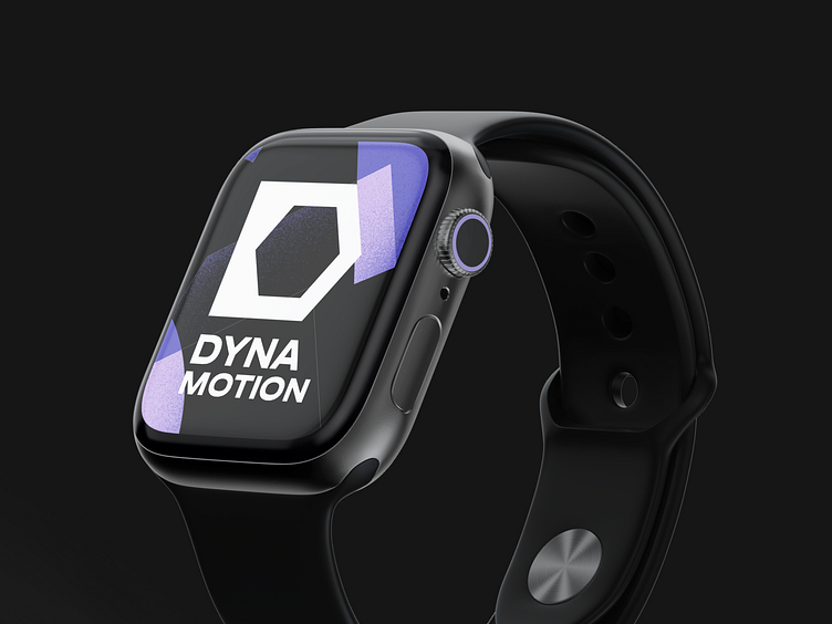
Dynamotion - Branding for motion design studio
Branding is a company's visual language that helps to reveal its essence.
Meet Dynamotion a motion design studio that is building a brand and a strong visual presence on the market to stand out among competitors.
Brand's name comes from the combination of the words dynamic + motion, which in turn sounds sonorous and carries the descriptor of the business niche.
Let's take a closer look at what we've achieved with this project 👇
Logo ideation & colors
The symbolic part of the logo is based on a pentagon, which symbolizes the multifaceted design motion directions and the face of a wrench.
The Pentagon is additionally inscribed in the container, which acts as a so-called wrench and carries the meaning that the company is able to tighten any nut (literally - to perform any task).
It is worth adding that the symbolic part is the basis for the future corporate style. The typographical part is grotesque, able to exist independently of the symbol.
The colors are accented, saturated, convey strength, emotions and ambition.
Illustrations
Illustrations create the atmosphere of the entire brand and give dynamics to the overall image.
They are a great design way to differentiate the brand as much as possible and become more memorable during marketing campaigns.
Any brand that uses illustration gains uniqueness and character. Images can tell the company’s history in a fun and informative way, addressing the audience at a visceral, emotional level.
Brand activism and image
Motion design studio Dynamotion moves not only inside the pixels, creating a perfect product, but also encourages its team to have an active lifestyle outside and inside work, supporting their interest in sports and movement, because the power of movement is the only eternal thing that exists in the world.


