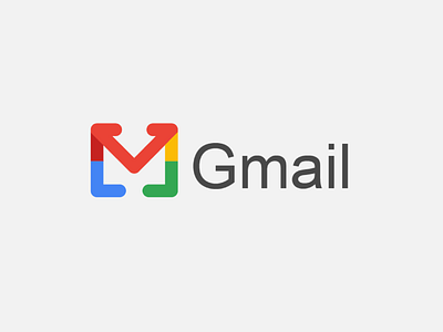
This is my redesign of the Gmail logo
I tried to design and keep it simple and look like a letter to give it the meaning of Gmail work actually this took me about time to keep it as you saw and to put the colors together in the logo. and about colors, I used the same color that in the logo of Gmail.I'd love to hear your thoughts! Leave your feedback in the comments 👇Let's talk about your brand projects: I'm currently open to new freelance opportunitiesyou can contact me here or by email: [email protected]
More by Mohamed Assaraje View profile
Like
