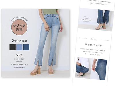
Past work: Product page design on a fashion E-commerce Website
■Product page https://item.rakuten.co.jp/twp-shop/z026-027/
■What I did
I summarized selling points based on its garment specification sheet and photos from my client, then I selected photos and made a product page with Photoshop.
Once I finished making the design, web director and the other team member checked it and I partly changed design if there were something doesn't feel right with the brand image or Japanese expression etc.
■What I kept in mind
1. When selecting photos
-Stretchy fabric that allows the wearer to move around stress-free.
-A design that allows the wearer's body line looks beautiful.
-Make legs look slim by showing ankles through slits.
→ I tried to select and edit photos which can deliver these selling points above.
-The model's attractive back, limb, toes, fingertips and glossy lip.
→ I tried to select photos to show her beauty.
→ As it was a design to sell the product, I tried to edit photos that show the beauty of the model in a casual way, not to disturb readers focusing on the product.
2. When designing the page layout
-More than half of customers shop on their smartphones.
→I placed subjects of photos in a form that draws a gentle vertical wave in order not to make them get bored when scrolling the screens.
→I placed photos of zooming in and out from multiple angles for the purpose of moving their lines of sight.
■Time I took to complete this design
1.25h
■Tool I used
Photoshop
