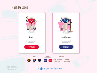
Flash Message UI/UX design
Today I did a practice on making cute simple Flash message, a research about the Flash messages helped me to understand the purpose of it more, and how to design a good Flash message.
- As you can see the colors play a big role in this, as the red color takes more attention and represents the psychological feeling of caution, error and danger.
- Meanwhile the blue makes you more relaxed and less distracted
- tell me what you guys think about the design and if you have any advice or recommendations 😍
More by BATUL SHAREF (Lola) View profile
Like
