Google Search Result Page Redesign

This is the 12th design in #100daysofdesign.I have used #Figma for the given Design.
I took 3 Hours and 15 min to complete my 12th Design Challenge.
I started with a Heuristic Evaluation of the Google Search result Page and Came across some flows and Pain Points.
Here are my listed Findings.
1. What if I can see a snippet of what kind of information the page contains once I hover over it?
2. I want to assure you that the results match what I searched for. So, showing some result Match info would be beneficial.
3. Users usually open multiple tabs to see which website has better results.Some
Pain Points:
1. Hard to Come across the best result quickly.
2. No quick Visibility of what kind of Content we will see on awebsite.
3. No labels for the search results.
4. Publishing data Read time and more relevant informationare blended with the description. So, it decreases readability.
5. No way to check the match % between what we searched andthe result List.
6. User open many tabs, and hard to compare which websitehas better content.
Based on the Pain Points, I quickly came up with some Features Set:
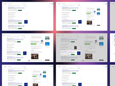
1. Show the website on Hover. ( Toggle Provided)
2. Many links can be opened in a single tab itself. Just the wayquadrants work on the website.
3. Labels for each result.
4. % Match between search and every result.The next step was to make the low-fidelity and then High Fidelity Wireframes.
Please have a look at the attached Prototype.
Feel free to connect me on my LinkedIn: