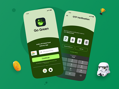
Day 1 of 100 Days of UI challenge
Day 001/100 Create a signup page, app screen related to signing up for Food App (" UX Learning + included " )"I know that making the Login screen is Redundant in 2022, But learning what I get out of this is as follows"
---Learning---
1️⃣. The login screen is the first screen user interacts with your App, so there must be an essence of your Product identity in the Login screen. Must use BRAND colors as an important call to action button.
2️⃣ . Never use SIGN IN & SIGN UP buttons because people often get confused similar we all get confused in PUSH & PULL sign of a door.
3️⃣ . While user is on Mobile app the fastest way to Login is to use the Phone number option for OTP, As it is quick and OTPs generally get autodetected.
#uiux #uxdesigner #uxdesign #appledesign #productdesign #100daysofdesign #100daysofuichallenge #ui #uidesign #uiuxdesign #uitrends #creative #creativedesign #figma #figmadesign #figmacommunity #foodapp #salad #ux #people #brand #learningux
