Valo Wellness Spa Logo + Brand Identity

What is Valo?
Valo Wellness Spa began with simple idea: to create something meaningful that enriches a community and offers an all-encompassing wellness approach. This idea sparked what would culminate into a landmark lifestyle hub in downtown Omaha that would transform and inspire a community.
The Challenge:
Valo, as a concept, stood at the perfect intersection between luxury and sustainability. The challenge would be to find a way to balance rustic, nature-based aesthetics with stark, modernity. Great care was taken to marry these two very different styles and values, in a way that feels effortless.
The Inspiration:
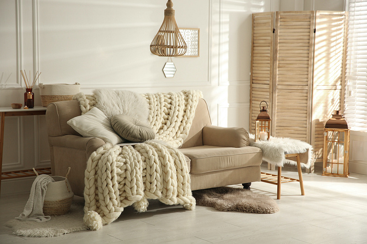
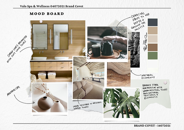
Inspired by Scandinavian Hygge values, cozy, warm textures and elements of nature were incorporated into the brand, while maintaining the modern, minimalism this brand hoped to attain. The mood board I created included many Swedish influences, homage to nature, and a nod to Eastern wellness practices. This collection of imagery would set the stage for the direction of the brand.
The Logo Design
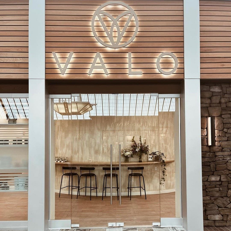
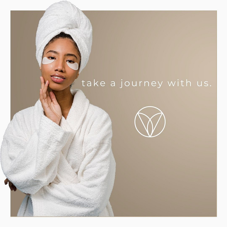
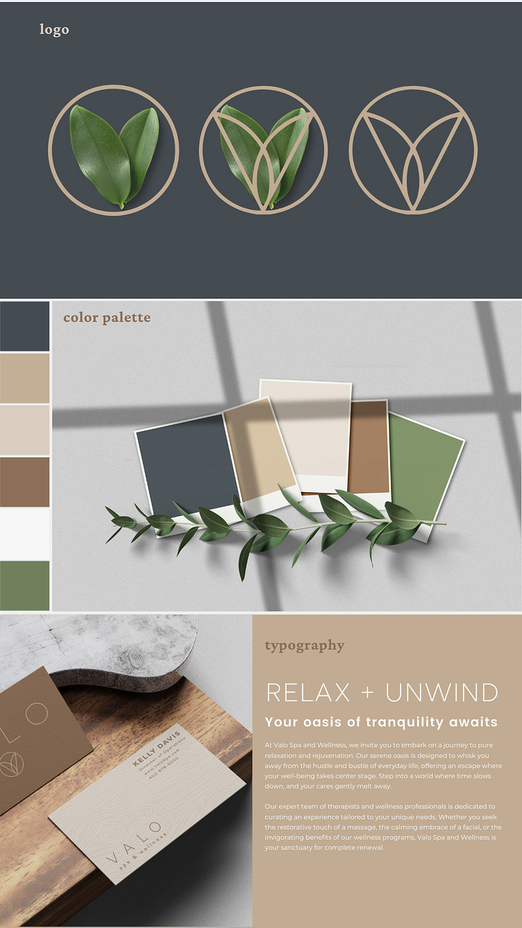
The logo was designed to encapsulate sleek, modernity through clean lines, while capturing a sense of nature in a way that felt authentic. Valo represents whole mind and body wellness. Circles represent notions of totality, wholeness, and cyclical nature. Sprouting leaves represent new growth, hope, new beginnings and a fresh start while being indicative of nature, which is the fundamental premise that this brand is built upon. The intersection of leaves create a V shape, which results in a powerful, memorable logo.
The Branding
Inspired by Scandinavian design, I kept the brand minimalist, letting clean, bold typefaces and graphics stand against a neutral color palette.
The color palette is directly inspired by the stylescape, borrowing from nature to create a palette that is in line with it's nature-based characteristics.
The Valo color palette was thoughtfully chosen with a modern, nature inspired, Scandinavian theme in mind. Charcoal blue, the darkest in the palette, is a soft and sophisticated alternative to a more traditional black. This color adds depth and grounds the other colors. Pavlova is a light maple wood tone that creates a welcoming neutrality, pairing wonderfully with Sandstone, a complementary hue. Chestnut balances these lighter neutrals with a rich, warm and inviting tone that adds complexity to the overall scheme. Finally, Sage offers a bright, fresh twist that breathes life and vitality into the overall theme. The result is a collection of natural, modern tones that help further tell the story of Valo.
The Results
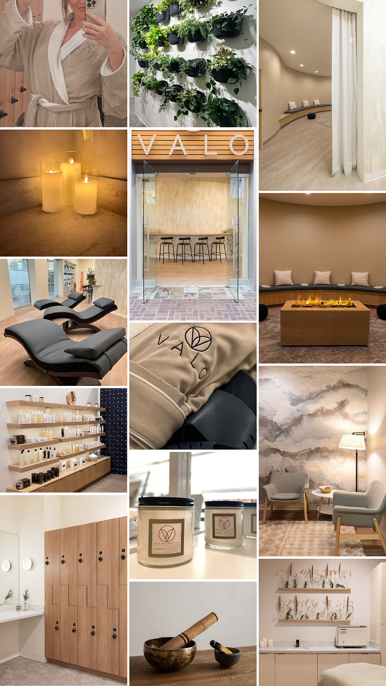
After two years of construction, Valo was born in what has been described as a perfect balance of exclusivity and inclusivity, telling the story of a luxury lifestyle brand that still felt attainable, welcoming and in tune with nature.
Additionally, the interior design and construction were meticulously crafted to embody the brand identity, influenced by the carefully crafted and curated stylescapes and moodboards.
A concerted effort in environmental stewardship was taken in all aspects of the design- from seeded, compostable business cards to removable candle labels to promote re-use, great care was taken to ensure that the brand was not only beautiful, but environmentally responsible.
What people are saying:
Be sure to check out Valo on Instagram, and drop me a line to let me know what you think! Cheers