Moon: NFT Marketplace for iOS

For my final project in Dribbble's Introduction to UI Design Course, I established the visual language for the new NFT marketplace app, Moon. I was required to lock in a visual and functional aesthetic, and then scale the design on multiple screens based on the wireframes and the flow that was provided from the client.

I also had to build a UI Library for the final UI and create a functional prototype. The end result was scaffolded by the completion of our weekly assignments and with the support from our team during mentor sessions. Enjoy viewing my process from my research to design to final product!
Design Research
The users of Moon are people who embrace, one way or another, the world of NFT and digital art. These users would be tech savvy and are very familiar with the world of crypto and NFT. The audience has a strong sense for visual aesthetic and art and they value curated and beautiful experiences as much as they do with the digital art that they create, buy and/or sell.
In order to accommodate the audience, my design research was focused on collecting and curating mood boards that showcased different styles of typography, colors, textures, and themes. After researching designs on Dribbble's community page, my mood boards were inspired by two different themes:
Mood Board 1
A more clean and abstract design...

Mood Board 2
and a natural and airy design.

Design 1: Clean and Abstract

Design 2: Natural and Airy
And the winner is....
Design 1: Clean and Abstract
Both of my designs had potential for further development, however the overall clean look of Design 1 displayed the NFTs and artwork in a more noticeable and effective way. With the darker background color, the artwork and NFTs will stand out and be the prime focus to intrigue the user throughout their experience.
I also reached out to my peers and friends, and the majority agreed that Design 1 was the better design for this NFT specific project.
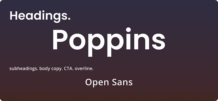
Fonts
The fonts for my design are Poppins and Open Sans. I wanted to be consistent with a clean look so I chose fonts without serifs to achieve this.
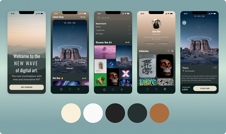
Color Palette
In both of my design concepts, I held on to one color which was the rusty orange (Hex: A53915) because I thought it was a nice pop against darker colors. Turns out it had a nice contrast with the dark purple and I was able to create my UI's background gradient with both colors.

Final Design
While working on my final design, I learned that simple is usually better for a positive user experience.

Prototype
After working on my visual design, developing a prototype was the next step. Prototyping is important because a user needs to test the product and give feedback before sending the design to development to build the actual product.
In conclusion...
Designing UI is not about about what I think is visually pleasing, but about making sure my design translates easily to all types of users even if the audience consists of more advanced tech users. I feel like I accomplished that with my design. If given another opportunity to iterate, I would scale back the secondary colors and play around with the composition more. Overall, I think what I designed worked out in the end and I truly enjoyed working on this project.
Thank you!