STL vs Errbody
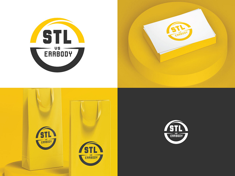
Just finished the logo for STL (St. Louis) vs Errbody. The client definitely wanted it to be in a circle. So I played of the circle and Gateway Arch (the top half of the circle in yellow).
Just finished the logo for STL (St. Louis) vs Errbody. The client definitely wanted it to be in a circle. So I played of the circle and Gateway Arch (the top half of the circle in yellow).