NFT Marketplace Prototype (UI/Figma)

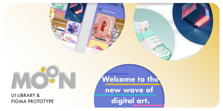
This is a case study on the NFT Marketplace mobile app I designed for Moon (a fictional client) for Dribbble's 4-week UI Design Course.
CLIENT: MOON, a startup whose goal is to revolutionize the NFT marketplace by creating an app with a design-first approach, and a deeply curated experience for its users.
OBJECTIVES: Create a fresh aesthetic for the design, which will stand out above a sea of other NFT marketplaces, thereby establishing MOON as the trend forward place to shop for the hottest NFTs being released. Scale this design across the multiple wireframes provided by the client.
DELIVERABLES:
Scaled design to completed wireframes
Visual language/new aesthetic for the MOON app
Complete UI library of all components, modules, typography and more
Functional Figma prototype
01 | Research and Moodboard
To begin the project, I completed a thorough exploration of the current NFT marketplace options. I reviewed a variety of MOON's competitors to get a feel for the current design trends, in order to determine what looks would set them apart from the competition. My conclusion was that the large majority of styles involved dark, moody backgrounds and overall heavy color palettes that weighed down the NFT artwork being presented upon them.
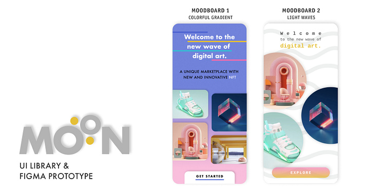
I opted to lean toward exploring two different directions that would both result in a lighter, more uplifting experience for the user (and for the artists who choose to present and sell their work with MOON's new app). Below, I have shared the moodboard I created where I gathered a variety of images to fit my desired direction.
02 | Visual Exploration
After gathering a variety of images as inspiration, I began to explore and create my two design directions.
OPTION 1: named "Colorful Gradient", which was still using a colored background like many existing marketplaces, but in a decidedly more uplifting vibe. I created a gradient using two colors from the custom color palette I created for MOON. Then I brought in other colors from the palette in a linework design that weaves through the title on the Splash page. My vision for this, ultimately, is that the lines would be animated for added visual interest to the user. The tiled NFT features would update and animate as well.
OPTION 2: named "Light Waves" was a much lighter version I explored as well. In this design, I chose to use a gray wave pattern in the background, bringing in the "new wave" tagline that MOON provided. I chose to use circular frames for the NFT features on the splash page, simulating bubbles. My thought was these would also animate by floating around and across the screen.
03 | Polishing and scaling the design, create a UI Library
Per feedback from my team, mentor, and the client, Concept 1 "Colorful Gradient" was selected for further development. The client preferred the rich, cheerful purple and noted that it was a more interesting backdrop for a variety of NFT art styles. They also commented that the wave pattern might slightly distract from the NFTs being presented. I was thrilled to proceed forward with building out the "Colorful Gradient" style, and I got to work.
Using wireframes provided by the client, I scaled the initial design across all screens, and further polished the elements of my design.
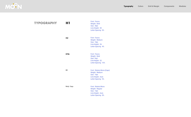
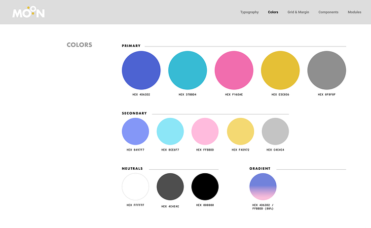
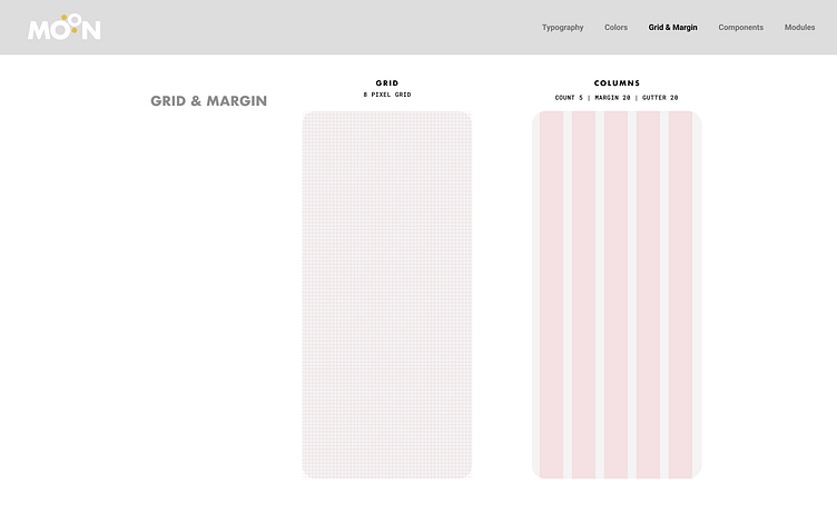
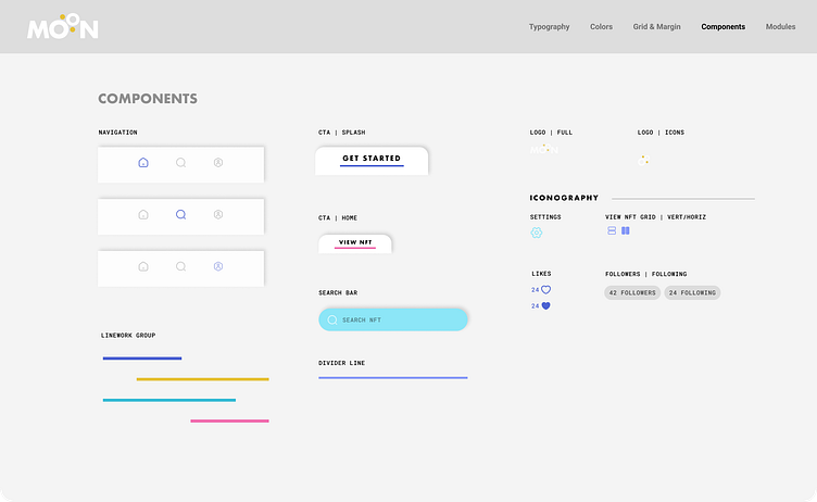
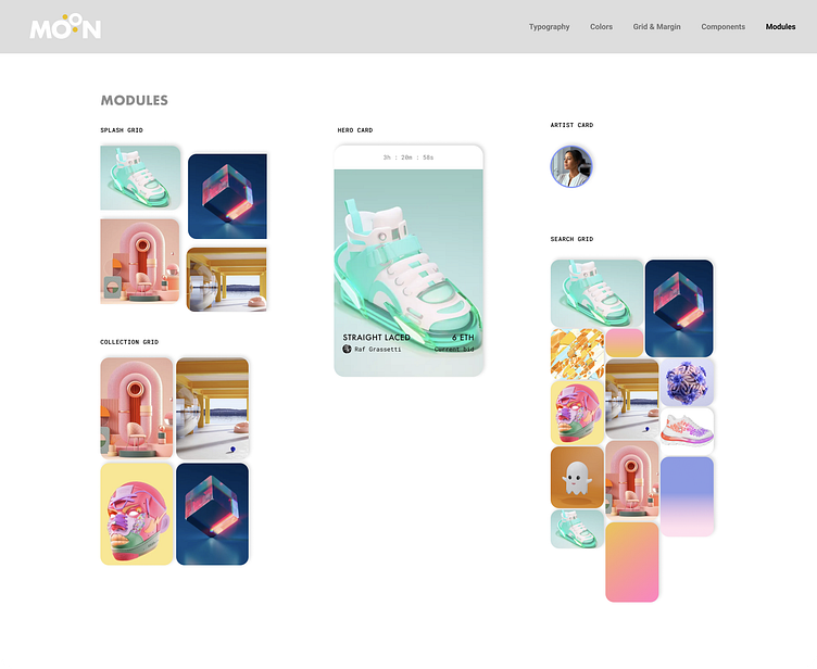
After my screens were finalized, I organized the typography, color palette, grid & margins, components and modules I used into a clearly communicated UI Library for the client. This will allow MOON to easily scale the design further going forward, per their needs.
Below is the UI Library I developed for the client.
04 | Prototyping the Moon app
Enter your text here...