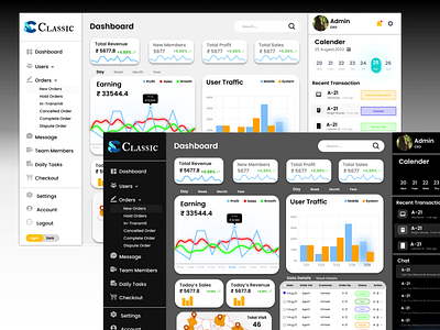
Concept Of Light & Dark Mode
Its Indicate itself By Its name ,this concept is based upon "Light & Dark mode"
its like Day & night , some people say positive or negative vibes hahahah....
but we developers & designer And so on who love to work in dark mode every time only we know the slang of dark mode or darkness.....
Original demo:
https://www.figma.com/file/4ZDPVa1DHmhJaH5l4B4tzs/Dashboard-Design?node-id=112%3A2
Process :
1. Research : I Search from you tube to dribbble to google For this devise. because at that time i have zero knowledge about dashboard &admin panel when i started working on live project then i got to know about all this.
2. Sketch : I Started making wireframes & mockups after researching for a e-commerce website's dashboard & i know it is not at that perfect but its just my first design for a dashboard for admin panel.
3. Design : firstly, I choose the color and font for each part (headings and sub-heading & content) and then make important assets Like header, Hamburger ,right side bar, rectangles shaped for content.
4. prototype: this concept of light & dark mode only depend upon prototyping because it is only one who help it for change it from light to dark or vice versa.
5. User Testing : I used to test this design with some of my developer friends so they loved it !
6. feedback : now its feedback time, my developer friends suggest to not to take some of the important things inside the dashboard (Like traffic ,revenue chart etc) & not to put extra element (like calender , clock ) the logic behind this is that if the admin can control the admin panel from their laptop or system so they can watch the date & time from their system.
Go & check this design and Make your first move also with your Innovative designs......
