NFT Marketplace App Prototype | UI / Figma


F I N A L P R O T O T Y P E
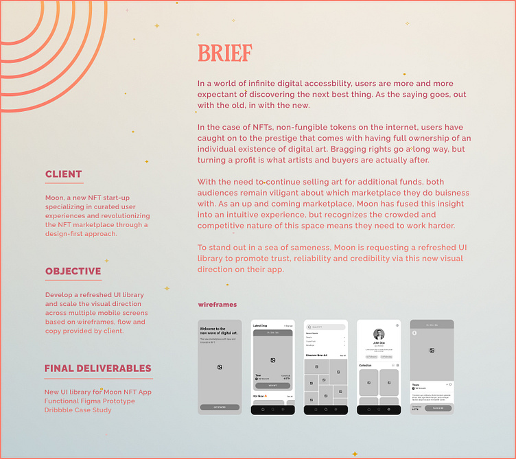
R E S E A R C H I N G T H E S P A C E
Following the brief from client Moon, my initial thought process began with, "What is an NFT?".
As a newish space to the internet, understanding the audience demographics, current marketplaces, UI design trends and why someone would buy or sell would be clear indicators of where this new visual library could go and how I could make Moon a strong competitor in its corner of the web.
After an evaluation of the landscape, I began to discover insight into the mindset of our buying audience — creative, fast-learning and always reevaluating their goals and desires. Humans that tend to lead trends, and pride themselves on discovering "it" first. A never settling mentality. With these attributes in mind, it made sense why I saw a common thread across Moon's marketplace competitors: dark, sleek, gradients allowing the art to shine while likewise exuding an underground, insider feel.
While the black tones seemed to dominate the marketplace, this audience's mental shifts based on what's new and different inspired me to try an alternative path. A lighter, cleaner and bold path that would make searches for the "it" NFT more intuitive and streamline their purchasing path.
Just like the Moon in the sky, I wanted Moon to stand out in a sea of sameness.
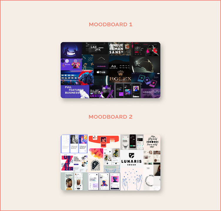
Moodboard 1 | Inspired by space elements that sparkle, I found inspiration from the sheen of an astronaut’s helmet as well as luxury brands using glow and metallic in their typography. This style followed the black and gradient tones common within this industry.
Moodboard 2 | Considering the audience of curious-minded individuals wanting to best new NFT, I was inspired by the clean and lighter white hues that showcase the art without overpowering the design-first marketplace.
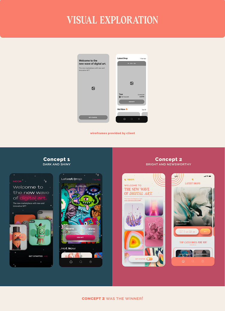
V I S U A L E X P L O R A T I O N
In week two of our client-designer relationship, Moon requested I begin defining the essentials of a UI library, derived from their provided wireframes and my moodboard concepts.
Using the Dark and Shiny look as my first guide, I applied gradients from gold and silver palettes to mimic the mirror effect of an astronaut’s helmet, developed a starry background to lean into Moon’s name and space theme, and put emphasis on key words we wanted to highlight through a pop of colored glow.
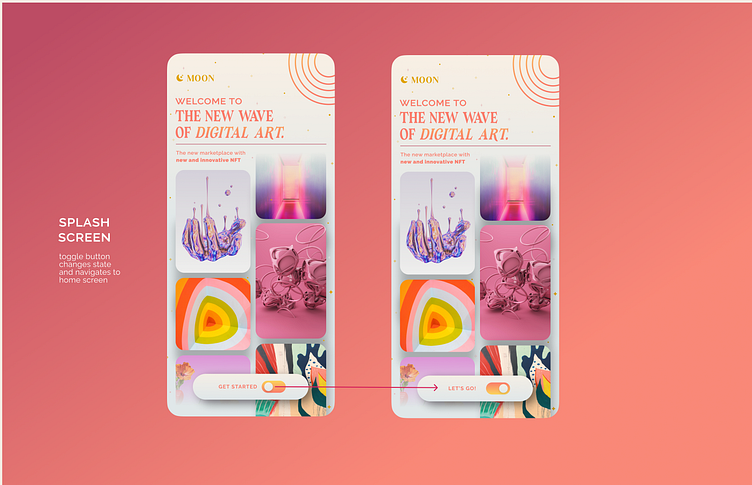
For the Bright and Newsworthy second concept, I was inspired by the moon itself, leaning into lighter hues and thin stroked iconography to pay subtle yet thoughtful homage to Moon’s name. The choice to use a modern serif type was inspired by newspaper headline design, placing Moon in the same camp as front-page stories. The graphics were likewise inspired by a classic source, featuring a vintage solar planet system design while still providing a modern edge through its gradient hues and geometric stars icons.
U I L I B R A R Y D E V E L O P M E N T
Concept 2 was the team's favorite, chosen for its differentiated light background and the 3D effect of the drop shadow and gradients. Presenting a modern, clean design helped to still differentiate from the dark, futuristic themes seen across several competitor NFT marketplaces.
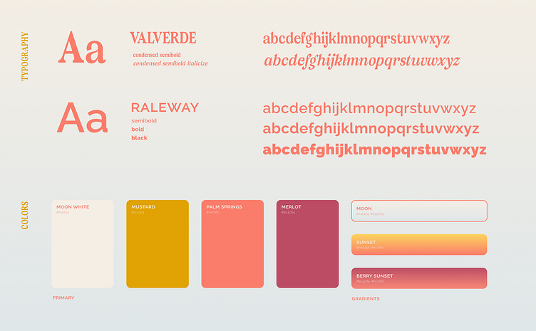
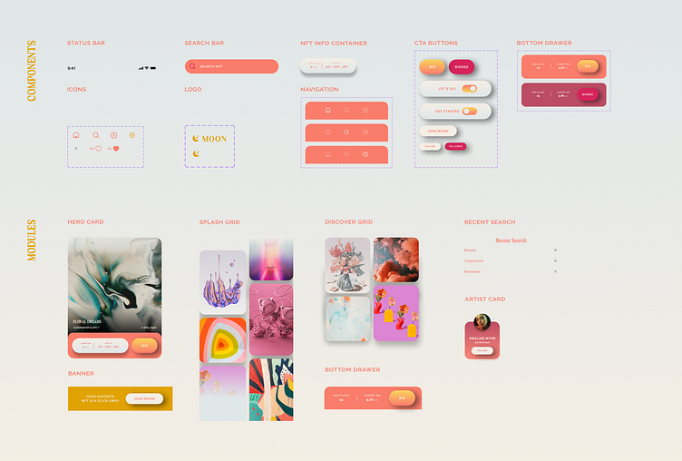
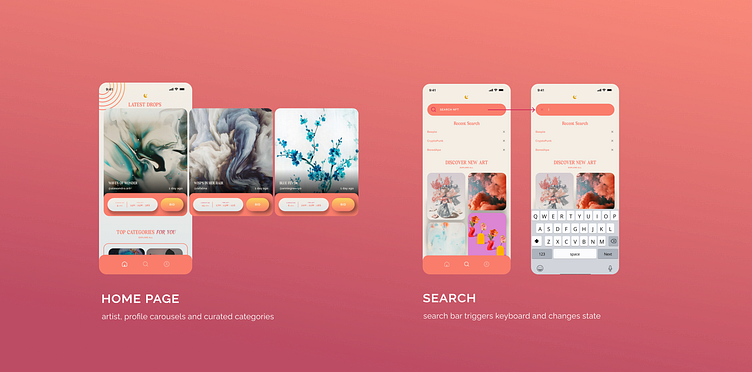
Across the next week, I polished and scaled this design across the provided wireframes and also developed Moon’s new Design System inclusive of Moon’s typography set, colors, components and modules.

F I N A L T H O U G H T S
Upon completing the four-week project assigned by Moon and the Dribbble team, I can genuinely express my enthusiasm for the final product!
As a designer without previous experience with Figma, learning and doing was quite the challenge. While several sleepless nights tinkering with the UI library and prototypes were had, the end result was well worth the work. Thank you to Moon, Dribbble, my mentor and peers for seeing me through to the finish line!
Love this case study? Subscribe for more future shots or check out my portfolio!