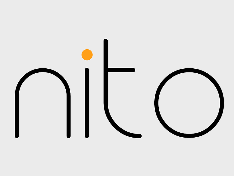
Logo Design - Nito
Logo Design for my design studio - Nito Design.
Key aspects:
· Thin and simple typography - Give aspects of modernism and professionalism
· No Icon - Distinguishes it from larger consumer brands.
· Curved rounded edges - Feel of transparency and approach ability.
· Black primary colour - modern and intelligent feel.
· Orange secondary colour - creates a contrast feel of creativity and excitement.
At Nito our message to clients is transparency - We fully prioritize user needs and the journey. This is well reflected in the logo design.
Let me hear some feedback on it!
----
Got a project that needs tackling? Work with me or my design studio.
Personal: [email protected]
Studio: [email protected]
Co-Founder and Lead Designer at Nito Design: https://www.nitodesign.co.uk/
See more portfolio work on Instagram.
OR get in contact via LinkedIn / WhatsApp: +44 7760887504
