Social Media Rebrand Pitch
We began by examining at the current brand feed & website. By taking the lead from its strong imagery and vibrant food colours, we injected a more fun, playful and modern spin to the current content - whilst enhancing its Renaissance feel.
The overarching look is to remain modern and cool, so historical elements are given a vibrant, pop-art and tongue-in-cheek twist to ensure they are fun and up to date.
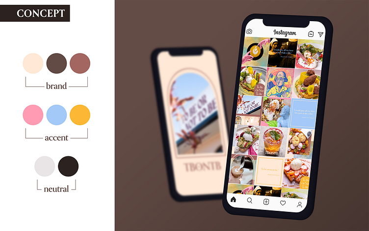
The established 'Brand Colours' are great for social media, in that they are modern and neutral enough to be used throughout the seasons.
Further 'Accent Colours' have been lifted from the food imagery - using colours directly found in your own menus to add a bright and eye catching pop. The colours selected sit comfortably next to the brand colours as well as next to each other.
'Neutral Colours' have also been added where readability is key - the black is an off black and the light shade is a pale grey. This is less of a harsh contrast than the usual black and white and sit nicely next to the brand colours.
The established font 'Orpheus Pro' includes optional letter variants that we have chosen to utilise, including 'glyphs' such as the diamond shape within the O, and 'tails' such as the flick seen on the N.
Edited content is designed to sit alongside the current brand photography. The content can be easily incorporated into the current Instagram feed by adding in edited posts when required, alongside the established regular photo posts.
Collage adds a modern, arty & cool twist to the food imagery and renaissance theme. The colours are fun and playful, the ideas humorous and engaging.
Animation is added to increase interest and engagement. We want to make the viewer smile, feel that they are easily able to reach out, to visit, and to engage with the content they are seeing. That the brand is one that is approachable, fun, modern and has a very unique twist on a Renaissance Shakespeare theme.


