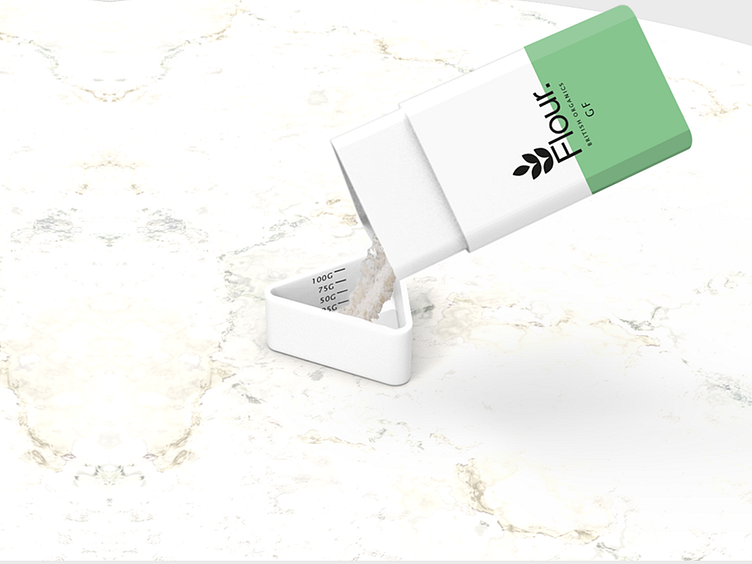
Flour Packaging Redesign
Flour packaging redesign:
The improvements:
- more visually striking whilst maintaining consistent brand identity
- simple but stand-out graphics and logo that is clear but draws you in
-sturdier structure that isn't so easily damaged
- lid doubles as a measurement cup
- clear measurement indicator on whole packaging
Let me hear some feedback on it!
----
Got a project that needs tackling? Work with me or my design studio.
Personal: [email protected]
Studio: [email protected]
Co-Founder and Lead Designer at Nito Design: https://www.nitodesign.co.uk/
See more portfolio work on Instagram.
OR get in contact via LinkedIn / WhatsApp: +44 7760887504
More by Nick Pinn View profile
Like
