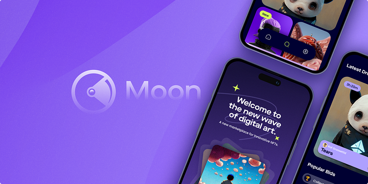
Moon - NFT App
⚜️ Design Brief
Moon is a new up-and-coming startup with the goal of revolutionising the NFT Market place business with a design-first approach and a deeply curated experience for the users.
My role: I worked on all areas throughout the product design process, from research and user flows through to visual design and documentation.
🤔 Problem Statement
The current NFT marketplace is already revolutionising the digital art scene at a very fast pace. With Moon tapping into the hype, the client wanted to stand out from the crowd and offer a user-first, seamless app that is scalable across different screens. Moon values curated and beautiful experiences as much as they want to celebrate digital art and the artists, making it the go-to buy and/or sell.
🌍 Audience
The general audience for Moon is all those personas who embrace and follow, in one way or another the world of NFT and digital art. These are mainly the savvy people that know their way online and in the world of crypto and NFT, with also a strong sense for visual aesthetics and art
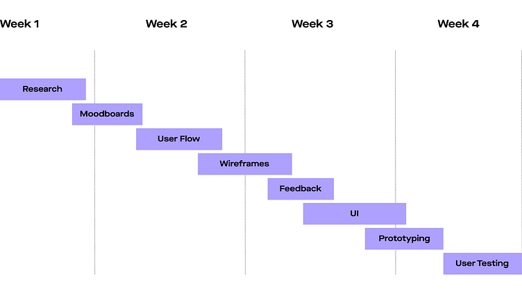
📅 Project Timeline
The project timeline is divided into 4 weeks of work. The first part of the first week was focused on research and benchmarking. The second week was focused on mood board creation, initial visual exploration, user flow, and wireframes. The third week was focused on feedback and UI which carried into the 4th week with prototyping and testing.
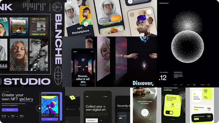
🔍 Moodboards
The initial moodboard stage started with sprint brain dumps of ideas through rapid research from Dribbble, Behance, and Pinterest, which quickly resulted in a wealth of directions. Given the name 'Moon' it was easier for me to narrow down my inspiration to space-related elements fonts and colours that eventually served as the backbone to the whole look and feel.
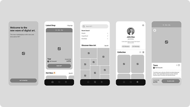
Wireframes
During the ideation state, we already had a sample of low-fidelity wireframes which were drawn on Figma, and then modified to high-fidelity.
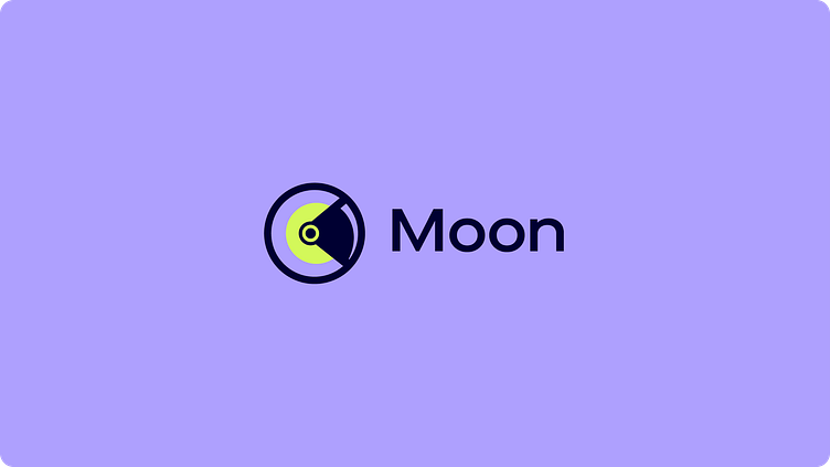
✨Logo
Designing the logo paved the way to start getting a feel of what the visual language can look like. This stage also enabled me to start developing a solid colour palette and font variables.
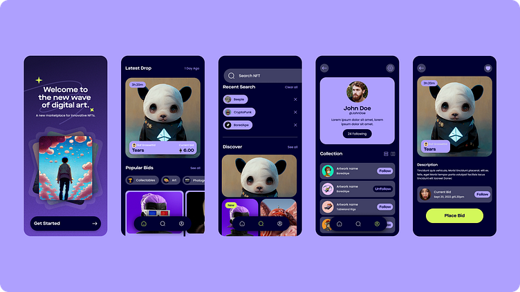
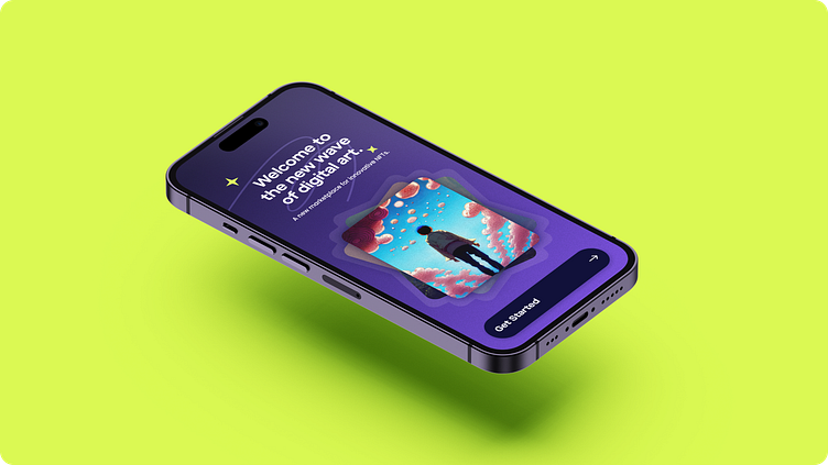
UI Design
The visual design of the user interface was designed to ensure that the same components, typography, and styles are visually similar from one screen to another which helps pre-empts additional confusion because the design language used shares a common meaning and functionality.
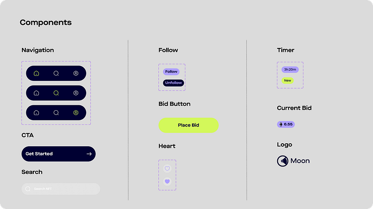
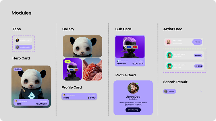
Design systems
A set of defined components and modules have been used throughout the screens to ensure consistency and scalability.
Prototype
To view the full prototype of Moon, click here.
Thank you 🙌🏻
Press “L” to show your love. ❤️
