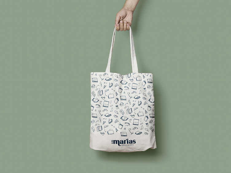
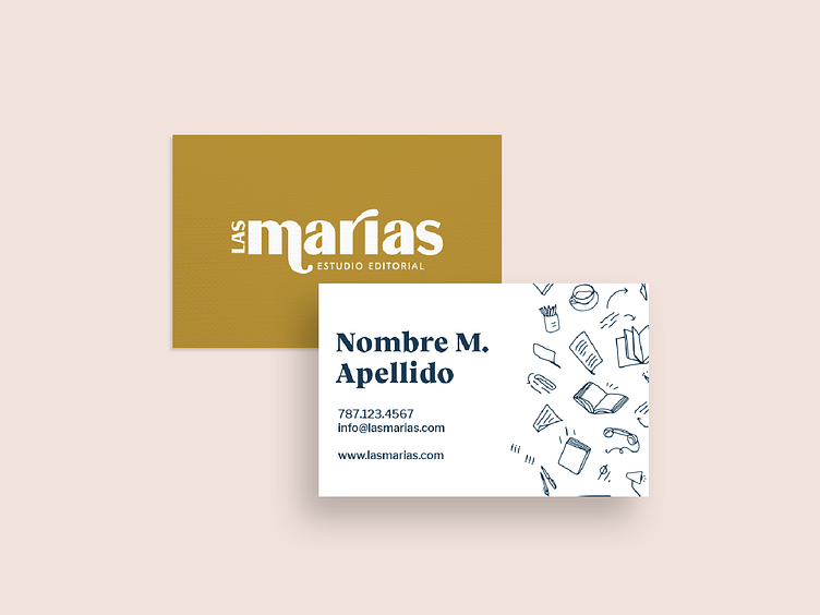
Las Marias

Brand Identity, Signage & Environmental Graphic, Editorial
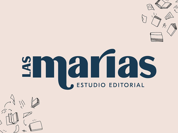
To make the name of this publishing studio pop out, we applied a combination of uppercase and lowercase letters to the logo. Design elements were created to simulate manual strokes of manuscripts and books´ corrections. The chosen colors and photographs give the brand a nice balance between vintage and modern styles.