Brand Identity for a Social Rehabilitation Center

Corporate identity for the Social Rehabilitation Center "Under the Wing"
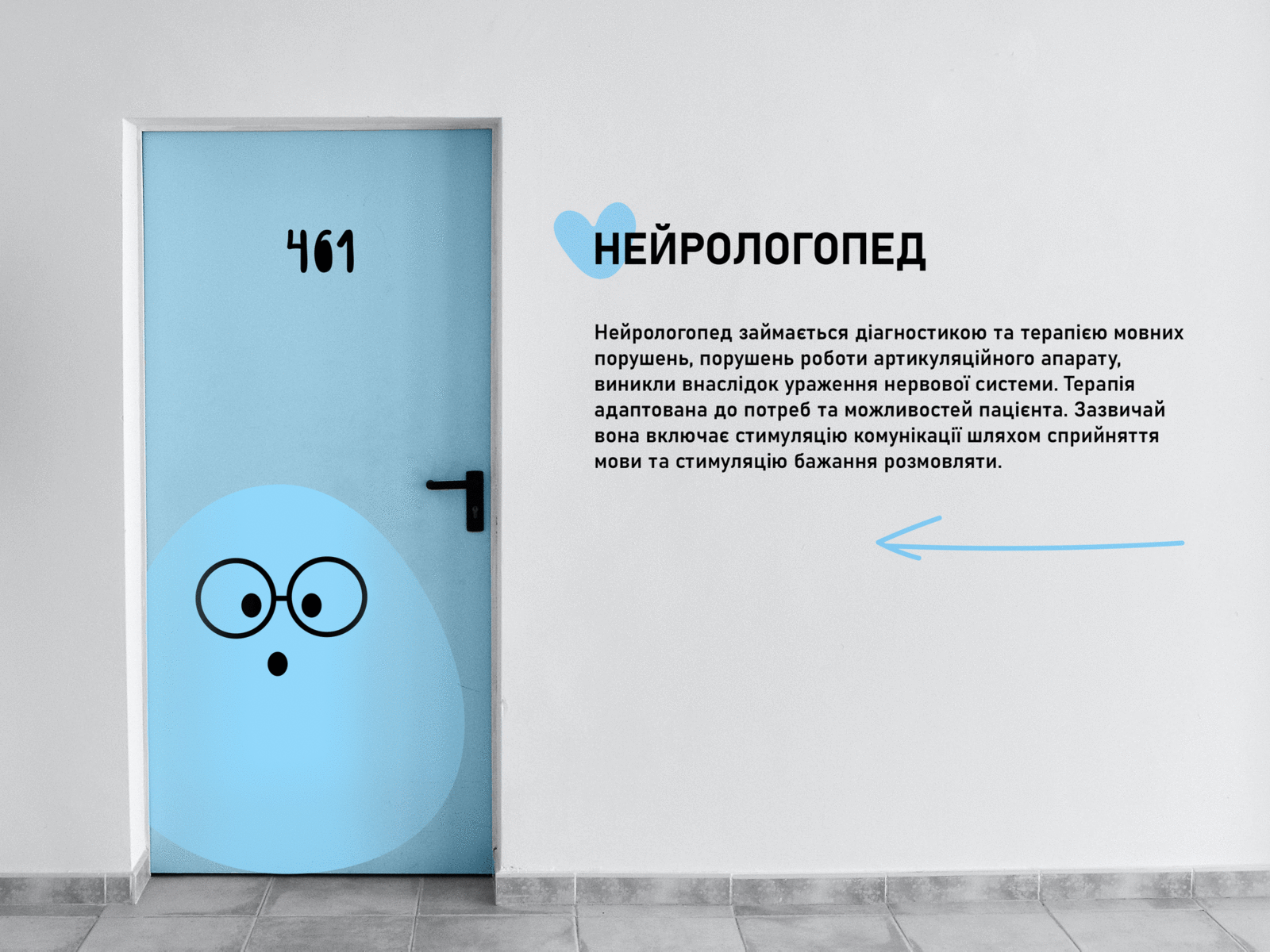
The project deals with complex rehabilitation support for children and young adults (from 3 to 25 years old) with movement disorders. The foundation's team focuses its attention on improving the quality of people's lives and their opportunities for self-realization in society, changing society's attitude towards people with special needs.
Task
The corporate style should convey the center's values: an individual approach to each family, care, kindness, and warmth to everyone who finds themselves here, and service.
Logotype
The logo consists of 3 parts: the sign, the font part, and the descriptor. The sign is created from simple shapes: the image of a hand, that is stretched out for help and support: "High five, you'll make it, we're with you, and therefore we're a force!" The letters in the name are hand drawn by me, they can also be used as a brand font for headlines and to get attention to the identity elements.