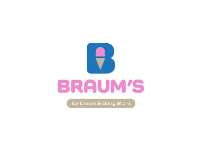
Braum's - Hypothetical Rebrand
Braum's is a household name in Oklahoma (where I'm from). The ice cream. The burgers. The milk. It's all amazing. But their brand feels a bit outdated.
I chose a typeface that felt more representative of the sloped scoops of ice cream, the staple of Braum's offerings. I also toned down the color palette a bit, playing off of a pink for ice cream and a brown hue for the cone.
Hope you enjoy!
More by Jeremy Brown View profile
Like


