Revisiting article layout
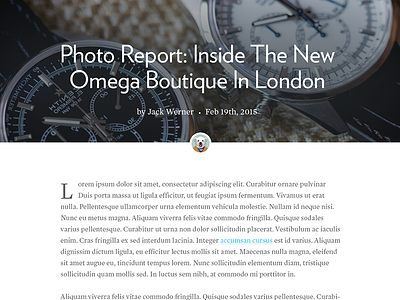
Since we're dragging ass on our project, revisiting the main article content areas of the site.
My drop cap is pretty haggard looking there, but this pairing feels more in line with the subject matter. Headlines are Verlag and Mercury for the body.
More by Mike Heitzke View profile
Like

