Product Designer @ Mangoes

Design tools used: Figma & Adobe XD
Project Summary:
I worked with the team at Mangoes from the very beginning. When I joined, it was just an idea, and I helped the CEO, the developer, and the QA to bring the app to reality.
The purpose behind Mangoes was to create the 'all-in-1' place for vegans, vegetarians, and anybody transitioning into more of a plant-based lifestyle. Our goal was to make being plant-based, easy. As somebody who is plant-based myself, I understood the struggle of travelling to a new country and not being able to find a suitable restaurant, or moving to a new city and wanting to find like minded friends. The purpose of the app resonated with me, and so I was very excited to lead the design process, from concept to reality.
User Research
Our target audience was anybody who was plant based, vegetarian, or looking to transition or learn more about the vegan lifestyle. We were initially launching in the UK, but hoping to expand worldwide within a few months of launching.
As a team, we had decided on some initial features which we thought users might find helpful (based on our own personal experience), such as easy-to-follow recipes, restaurant suggestions based on location, as well as community features to meet like minded people. However we really wanted to create an app that our target audience would love, and truly benefit from, so we decided to open up the discussion to them.
User interview & survey
I posted on various online community pages & social media platforms to understand what features our target audience would most benefit from in an app.
I posted in relevant pages, such as 'Vegans UK' Facebook group, and spoke to members of Vegetarian Societies at a few different universities around the country, to make sure that the data would be useful to us. As well as targeting members in these vegetarian groups, I also gathered responses from people who were meat-eaters, to understand what their biggest hurdles were to living a more plant based lifestyle.
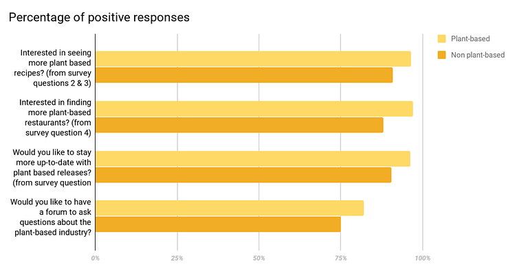
I gathered over 100 responses in the survey, which confirmed our target audience were interested in the features we had already thought of, as well as providing us with some valuable ideas about potential new features. New features they suggested were: ways to give back/charity work within the app, and a podcast where they could listen to inspirational individuals about nutrition, the vegan lifestyle, and travel.
This initial user research was extremely useful as we learnt which features people were most excited about, so we could structure the app based on their preferences, and prioritise features accordingly. This would help maximise our downloads for launch, and ensure the users wants were met.
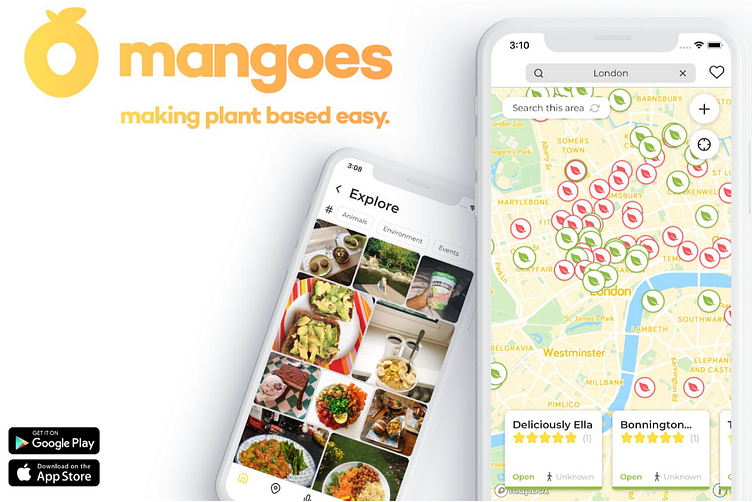
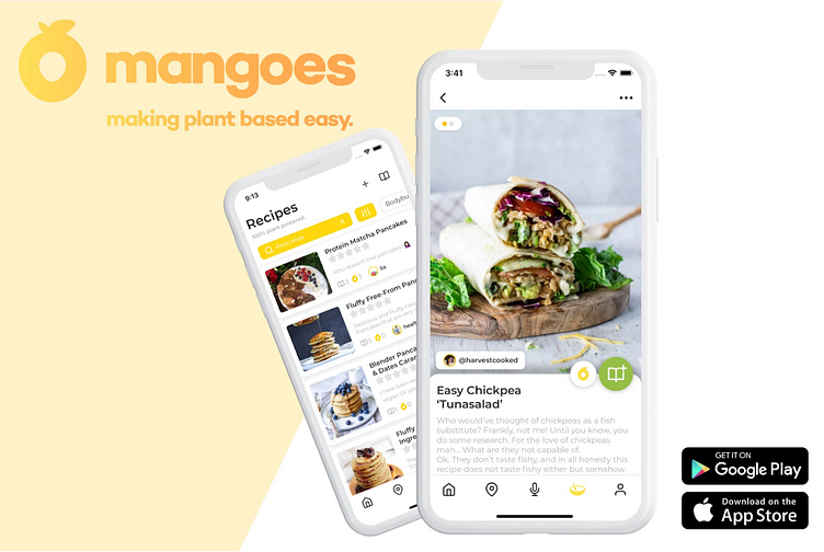
For example, some valuable information we learnt was that 50% of the individuals who 'wished it was easier to find vegan restaurants', happened to be meat-eaters. It told us this was one of the biggest hurdles for people when transitioning into a plant-based lifestyle. Based on this information, we were able to focus time on designing a location-based interactive map, which gave you suitable restaurant and cafe suggestions (offering V & VE options) wherever you were in the world. This went on to be one of Mangoes most popular features, and we ended up adding 2000+ restaurants around the world in locations where our users were based.
Beta Access - User Feedback
Once I had completed the initial designs and the features had been built, we decided to open the app up for Beta Access to a small group of micro-influencers who were going to help us market the app. The idea behind this was to receive feedback on:
1. The usefulness of the app - do you find Mangoes useful, and does it align with our goal of making plant-based easy?
2. Is the app usable? - does it function well, without any bugs? Do you understand all of the features, and know how to find them?
3. Is it desirable? Do you enjoy going on Mangoes?
4. The accessibility of the app - is the app accessible for all? For example, do our recipe features have options for those who are gluten free? Does our interactive map feature show recipes in multiple different countries?
Rather than doing another survey, during this stage I communicated with these micro-influencers via email, and had more of a personable relationship with them. As they were going to be helping with the marketing, it was important that they felt as if they were a part of the process, and making a difference to the final outcome. As well as communicating via email, I also did some usability testing with these micro-influencers, where i'd give them specific tasks to complete on the app, e.g. adding a recipe, whilst I would observe and take notes. The usability testing gave us some incredibly beneficial information, and made us aware of certain bugs/functionality issues we weren't previously aware of. For example, we noticed that individuals who had their location services off couldn't access the restaurants on our interactive map, so we needed to create a pop up asking them to change their phone settings.
Visual Design
After creating the initial wireframes, one of the next most important stages was to come up with the design style and colour palette.
Our target audience was 18-35 (close to half of all vegans are aged 15-34, with the average age for turning vegan being 24), so I wanted the interface to appear youthful, minimalistic, and bright. Minimalism as a design choice has been rising for many years now, and if you look at many leading tech companies, you will notice that simple, informative and minimal interfaces are increasingly popular. As we had a lot of (quite complicated) features we wanted to include, we didn't want to overwhelm the UI, so we kept it quite simple but added fun accent colours of yellow & green.
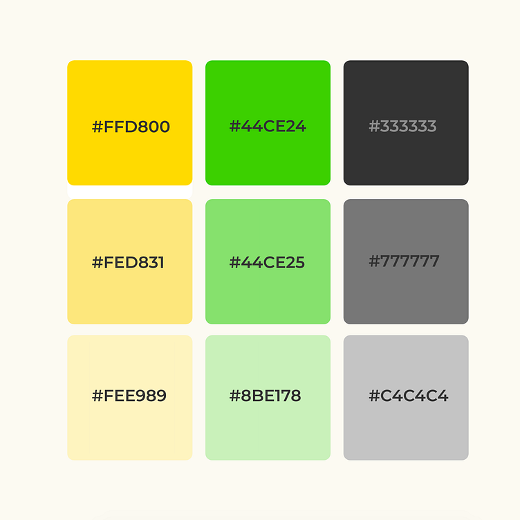
Yellow was our first accent colour for a few reasons. Firstly, the name Mangoes had already been chosen and some initial logo designs had been created, with soft yellow & orange tones. Secondly, yellow is linked with cheerfulness, happiness, optimism. It inspires hope, enthusiasm, and fosters positive way of thinking, as well as a thirst for knowledge. This was really important for us, as our mission was to 'make plant-based easy', by providing information and resources. We also were trying to build a community on the app, so we needed to create a fun and positive experience for the users, so they'd want to keep coming back and share user-generated content.
Green was our second accent colour, and out of all of the colours on the colour wheel, green is often regarded as the most relaxing colour for the human eye. It symbolises harmony, health, and life. As Mangoes was about living a healthy plant-based lifestyle, I felt as if it was important to include green in the colour palette.
During the entire design process at Mangoes, from initial wireframes through to hand-off, I followed some fundamental UI principles to ensure the app felt easy and natural to use, not confusing for the users, and that it does what the user needs.
One important UI principle I followed included ensuring that the UI was consistent across the platform. As well as the mentioned colour palette, these consistencies included using a uniform style and size of fonts, spacing, curved edges, and image style, to name a few.
Another essential principle I followed was avoiding clutter in the design and ensuring that every element is functional and has a purpose. We had a lot of complex features to build, so I didn't want any unnecessary clutter in the design. This could've made it complicated for the users, and it was important to keep the requested features as the main focus, and and user's wants and needs at the core of the design.
The outcome:
We successfully launched Mangoes in January 2020 and got 1000+ downloads within the first 3 months of the launch.
Once Mangoes had launched, I continued to gather user feedback through questionnaires & interviews, making practical use of our email marketing sign-up list. The more feedback we received and the more features we refined resulted in increased daily active users.
Although we were getting new users downloading Mangoes, it was the increase in our daily active users that told us our UX was working effectively. Seeing our users spending more time on the app, posting more user-generated content, and leaving us 5* reviews gave me the confidence to continue gathering research and refining the designs.
Please feel free to contact me at [email protected] about future projects & collaborations! 😊