Urlike Bell Bestattungen
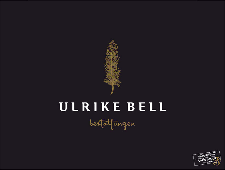
Logo concept for a small, women-owned funeral home focused on counseling and pastoral support in Austria.
The client envisioned an organic logo that communicates tradition, but doesn’t feel dated, and emphasizes empathy and personalization.
I created a sophisticated combination mark that features a leaf – as no two leaves are alike. It’s paired with a classic serif type and a script font that evokes ideas of elegance and femininity.