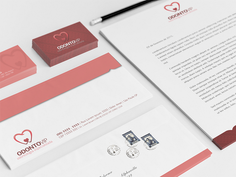
Branding #1
My client wanted re-design her logo, it was a tooth that have a heart below it, she loved her old logo and I had to convince her have a new visual.
It worth it. I really like the type that I used, and she loved the result of the heart, the tooth and the colors.
More by Ohana Fiori View profile
Like
