Free design gets you exactly what they pay for: Nothing.
It’s my own fault. I have been through this song and dance enough times to know how it always ends. I could have turned it down, but I didn’t. I should have set expectations from the outset, but I was too impatient. Sometimes the work is more important than the money, and that’s how they break my heart, because by the end, the work is ruined anyway, and I have nothing to show for it.
There is, however, a special place in my heart for non-profits. I don’t do a ton of volunteer work, but when I have the opportunity to help an organization that is doing good in the community, I never say no, and I never charge. Such was the case when I was approached about creating a logo for an organization consisting of law enforcement officers and their families and friends who provide local outreach and humanitarian services within their community. It is called Deputies Beyond the Badge, and it seemed like a worthy cause.
I agreed, and the sketching began.
Before we get into the work and how everything went terribly wrong, I’d like to mention that part of the reason all of this turned out badly was because I did not follow my own rules for pro-bono work that I laid out in my blog post Free Design Work Tomorrow.
If you ever take on free work and want your time to be worth it, please read this post and consider taking the advice. At the very least, it might save you a little time and a lot of heartache.
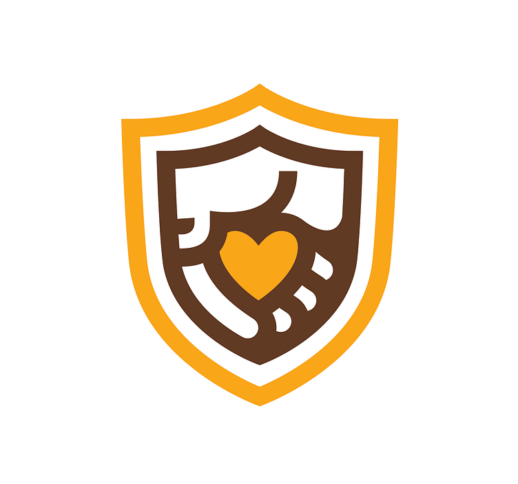
And so, the challenge lay before me. Design a logo for a non-profit organization. It needed to indicate its law enforcement origins equally with the community outreach service it provides. It should be easily identifiable as a non-profit and feel like it belongs in the space with multitudes of other similar organizations. My initial concepts focussed on the letter form "D" and trying to incorporate the badge in there somewhere.
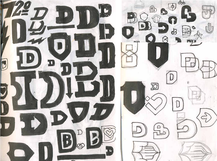
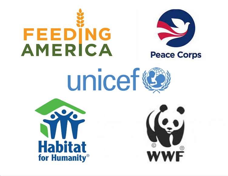
After struggling with and ultimately abandoning the letter form solution, I reviewed some of the world's most iconic non-profit brands I needed to focus on the charity aspect.
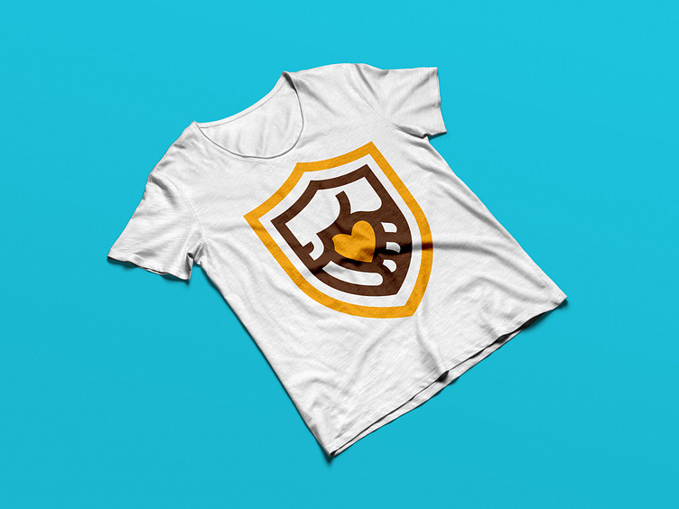
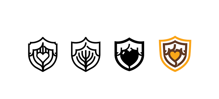
It became obvious to me that the community aspect needed to take the lead in the design, so I explored hands. I know I know. It's a bit cliche, but I think it communicates the goals quite efficiently and it captures the softer, more compassionate feel that I think is important, especially given the Law Enforcement nature and recent events in the news.
I was very excited about the look and feel and began pairing the mark with typefaces. It was coming together, but the overall mark was not balanced.
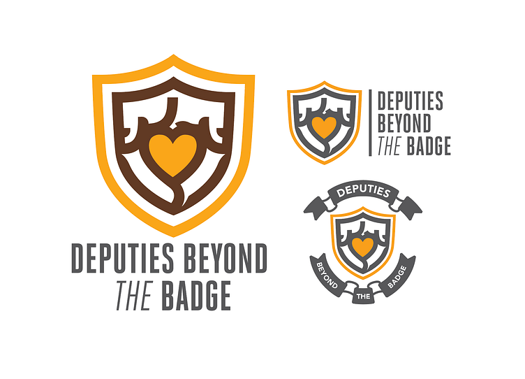
I went back and reviewed those iconic non-profit brands a second time and noticed a softness to their look and feel. Armed with a clearer vision of how the lockup should work I chose a more appropriate typeface and sent off a presentation for the first review.
Before the first review, however, I got some initial feedback that the hands were not "obvious" enough. I was annoyed, as I think most designers might be after such specific considerations and research, but I listened and went back in with an eye to clarify. I hate to admit it, but they were right. The hands were not super clear in the first version. I preferred the new look so I considered this a win. I updated the presentation and sent it back in.
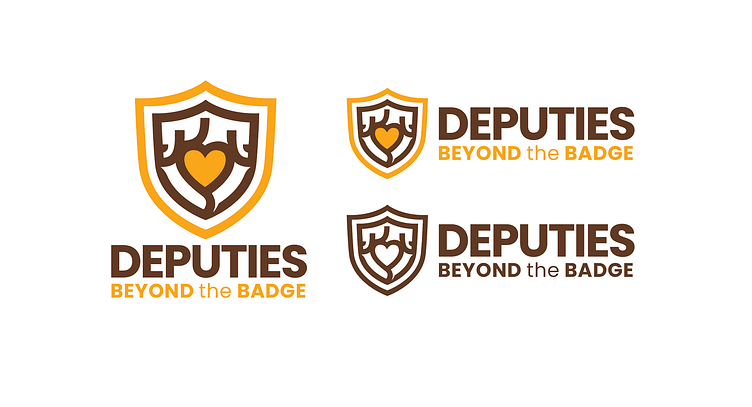
Absolute homerun right? WRONG. I heard those words that all designers and creatives dread, “We love it…but…" From experience, I have learned you can ignore everything before the but. The issue was again the hands. Not clear enough. This is when I started to suspect that this project, or at least my participation in it, was dead in the water. But I didn’t listen to my instincts and since the last update made things better, maybe this would improve it even more..
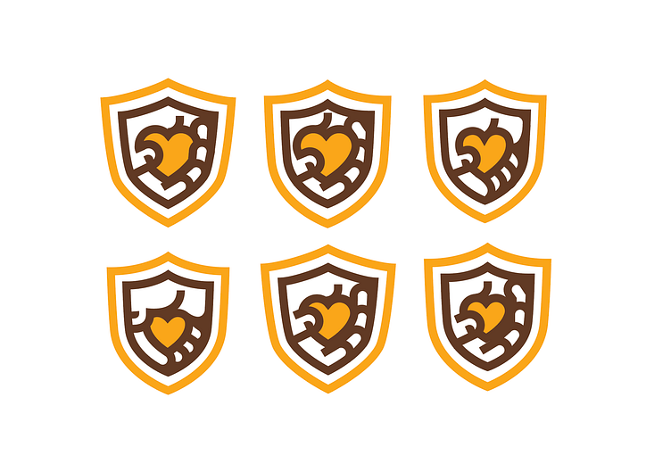
I was wrong. The new hands didn’t change enough to feel different from the previous version and the client balked again. I made a rookie mistake.
They were now sending “examples” of hands that they liked. I had to calmly explain that I can be inspired by the positions and gestures of the hands they sent, but any direct copying would be the same as stealing. This is where I knew it was done. They were designing it now. It was not mine, and now it was no money, no control. I wanted to walk away but I stayed for one last re-design.

I could lie and say it was for the good of a non-profit organization. I can pretend it was my pride. Neither is true. I am an idiot. That's the truth. I thought I could wow them with my unparalleled brilliance and get them on board if only I had one more chance. One more presentation and I would be sending files and waiting for my SWAG in the mail. I created multiple versions of the new hand examples they’d sent and organized an overview of the older designs and the new ones so they could see everything together. I wanted the board to recognize just how far things had come but also to force them to look at all the free work they'd gotten. A kind of "it’s time to wrap this up" gesture. Oh, how naive of me.
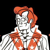
As you have already guessed the new logos didn’t cut it either. They now wanted a star instead of a heart, and a different hand altogether. It reminded me of the Ship of Theseus thought experiment.
If you replace every board of the ship over time until none of the original boards remain, is it still the ship of Theseus, or something else? That’s what happened to this design. If they change everything I did, is it even my work? Well, I finally told the board that I had reached my maximum allotted time to work on this project and wished them my best. At the moment I am not accepting pro-bono projects, but I’ll give it time, and eventually, I’ll be ready to get hurt again.