PAW - The app for professional pet care
For Dribbble's Product Design Course, we were tasked with creating a dog-walking app from concept to handoff over the course of 7 weeks to learn the product design process.
I found that many pet owners expressed concerns around the safety of their pets and credibility of the walkers on these apps. Because the barrier of entry to become a walker on other apps is quite low, one could easily hire somebody with little to no experience of dogs and no ability to handle a dog in a scary situation.
I wanted to explore a way to reassure pet owners that their animals were in the care of individuals they could trust.
This is where PAW Professionals came in. What differentiates PAW from other apps on the markets is that all pet-care providers must have relevant credentials and will be thoroughly vetted (😉) in order to provide services via the app.
This way, pet owners know that their pets are in good hands, and can review pet-care providers' credentials to find the best fit for their pets' needs.
Read on to learn more about the PAW app and how it was designed to give pet owners a safe and reassuring experience.
User Research
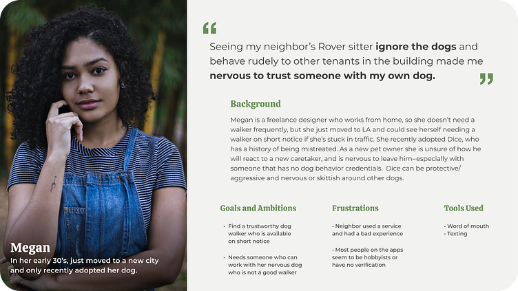
To get a sense of what might be most useful for users of these apps, I spoke with several dog owners with dogs of varying ages and temperaments. None of the three individuals interviewed used dog walking apps, and one person had witnessed firsthand the dog-sitter her neighbor hired through one of them neglecting the dogs she was in charge of and being rude to tenants of the apartment building.
In my research, I found that the most common way people found and hired dog walkers and other pet-care was through word of mouth. If someone successfully hired a walker through an app, they often booked further appointments in person or via texting, rather than continuing to use the app.
Overall, the main concern interviewees expressed was that anybody is able to join these apps and start walking dogs. Especially in the case of rescue dogs and pandemic puppies, they felt that they needed a walker or pet-care provider who would be able to handle dogs not only on normal walks but also in unpredictable situations like altercations with other dogs or in the presence of triggers.
During this stage I also did market research on obvious competitors like Wag! and Rover. Beyond those, I also looked at Meowtel, a cat-sitting app, and ZocDoc. Because many pet owners take their animals' health and safety as seriously as their own, it made sense to me to create an app that does the same.
User Journey
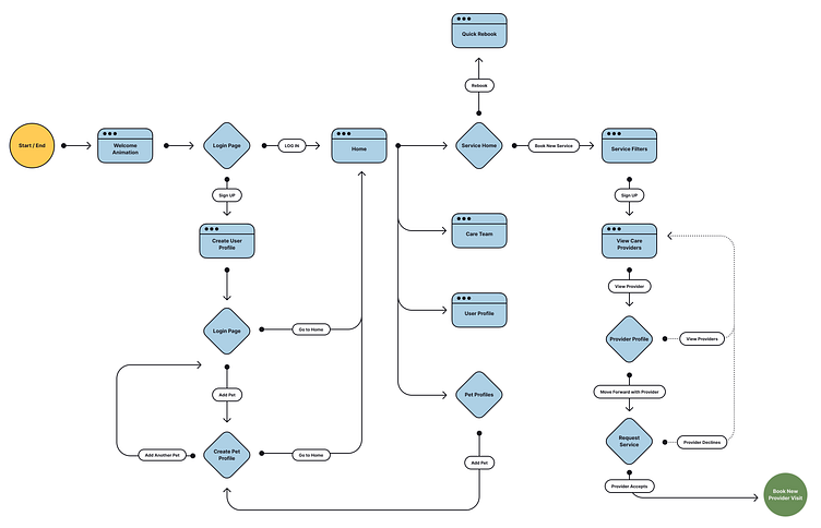
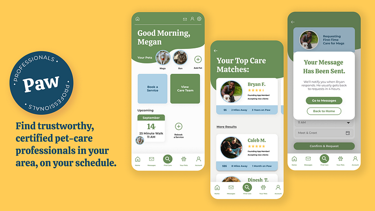
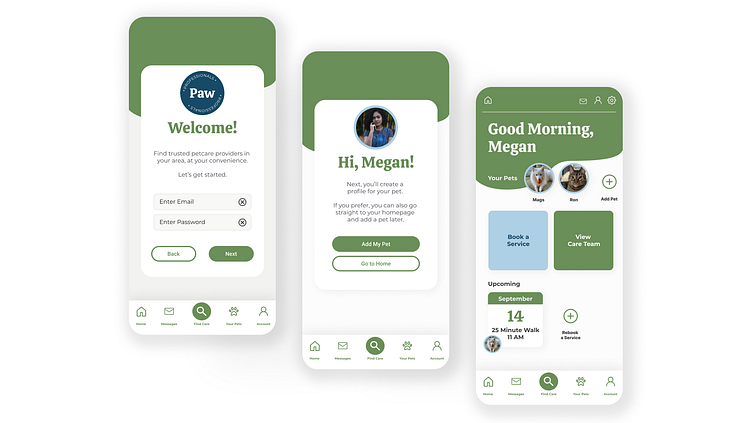
Next, I explored the onboarding journey of a first-time user of the app. After completing signup, they would be able to immediately proceed to their main profile and see what kinds of care would be available.
Another option would be to start adding their pets, a crucial part of the onboarding, since the user would add attribute tags to each pet that would be used to find the best care providers possible. These would be things like energy levels, health concerns, and behavioral traits, all of which would be taken into consideration when choosing a provider.
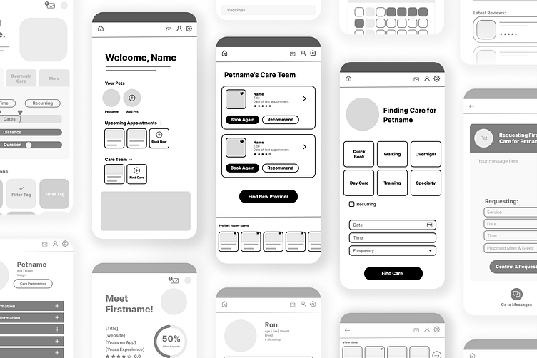
I worked through several iterations of wireframes to create a simple flow and make everything as easy to navigate as possible.
Visual Design
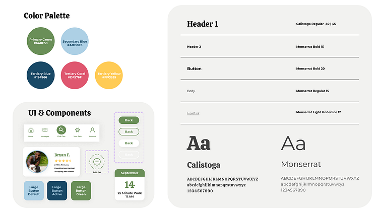
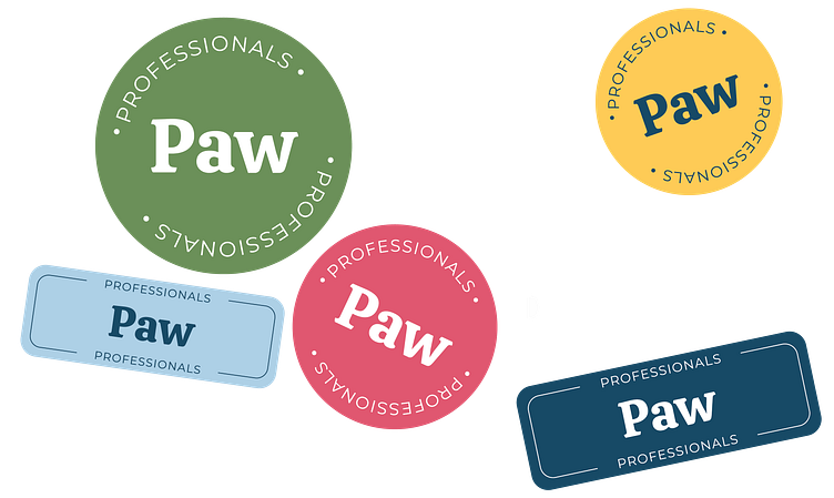
I wanted the look and feel of the app to be friendly but still professional. I choose a semibold serif display typeface with a fun taper on its terminals and some other unique flairs. I paired this with a serif font to counter the playfulness of the display font. Both fonts have a tall x-height so the pairing feels intentional.
I knew I wanted to use blue in the brand colors since it's prevalent in brands that want to convey trustworthiness, and I also chose an olive green as another primary color to keep the look from feeling sterile. I also selected yellow and pink tones as tertiary colors that can be in spot illustrations or when needed for active states, etc.
Once applied to my wireframes, it started looking a little something like this...
User Testing and Prototypes
Next came the fun part: prototyping. I got some helpful feedback from my classmates and from others, especially around copywriting in the earlier iterations of my designs that were unclear.
During this stage a lot of tweaks were made to the app in every area, from a complete revisit of my user flow, to smaller design tweaks like font sizes.
Try it out for yourself:
Learnings
Overall, it was incredibly valuable to experience the product design process as a whole. My main takeaway is that the process is not linear, and it's important to be open to going back into your work to change things.
The stage at which this became most apparent was the prototyping stage, where I found gaps in my wireframing and even UI design. I'm sure as I become more comfortable with product design, things like button states and smaller sequences within the overall user flow will become standard to most products.
My other takeaway is that there's no need to reinvent the wheel for every aspect of product design. Some things just work, and getting too creative with layouts, UX, and even copy can make a product harder to use. Even if your app idea is genius, if nobody can use it, it will never catch on. Aiming for simplicity became the main goal, which I really enjoyed.
Due to the accelerated nature of the course, this product is certainly not perfect, but it was a great opportunity to learn about what goes into product design, where my strengths lie, and what I need to work on. I look forward to learning more.
Thanks for stopping by!