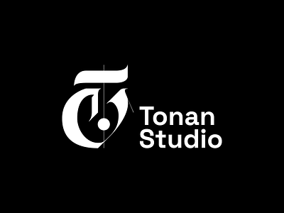
Tonan Studio rejected logo 1: neo-gothic T lettermark
Heavily inspired by neo-gothic typography, this T lettermark was made to show the elegance of Tonan Studio’s work.
Moreover, to add contrast but mainly to symbolise the symbiosis of nature (the curves) and technology (the rigidity), using a modern, monospaced-inspired font (like Space Grotesk showcased here) was proposed as a complementary idea.
More by glypse View profile
Like
