Saasmanager and Apiwatch Logo redesign
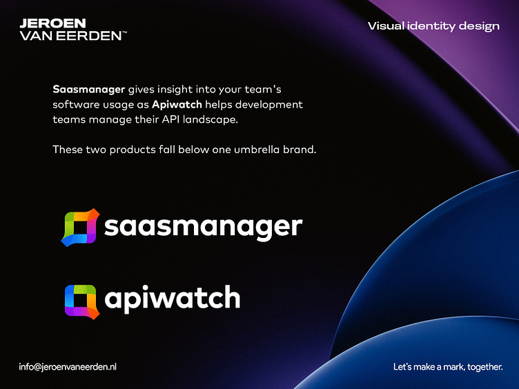
Saasmanager and Apiwatch Logo redesigns // Two products which fall below one central brand umbrella.
Once we settled for the 'saasmanager' concept, my client asked me to take this symbol and think about possible ways to extend the way the logo is created for the second brand product as well. As the first concept was also focused around the letter 's', I saw pretty fast a possible solution for a lowercase 'a' direction.
Happy to hear feedback and your initial thoughts about this logo extension for a second product. 😊
Have a great day everyone!
-Jeroen
Are you interested in working with me?
Feel free to reach out via the Dribbble inbox or direct e-mail:
👉 [email protected]
