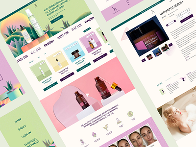
Austrian cosmetics website
Here I made a site with a mobile version for the pharmaceutical care cosmetics. neither wanted bright, youthful, but at the same time natural colors that would emphasize the natural character of the ingredients. We decided to use juicy illustrations and geometry, as well as gradients with "noise". A complex work with color was done, as it was necessary to combine yellow, pink and green - these are very bright and contradictory colors :)
Would you like to work with me and create a thoughtful, modern and user-friendly website? Then write to me!
I work worldwide, you can connect with me at
e-mail [email protected]
at skype maya1992tut
or via Whats App +375257106157
Also you can check my Behance portfolio here: https://www.behance.net/maya1992ba13
More by Maya Matveenko View profile
Like
