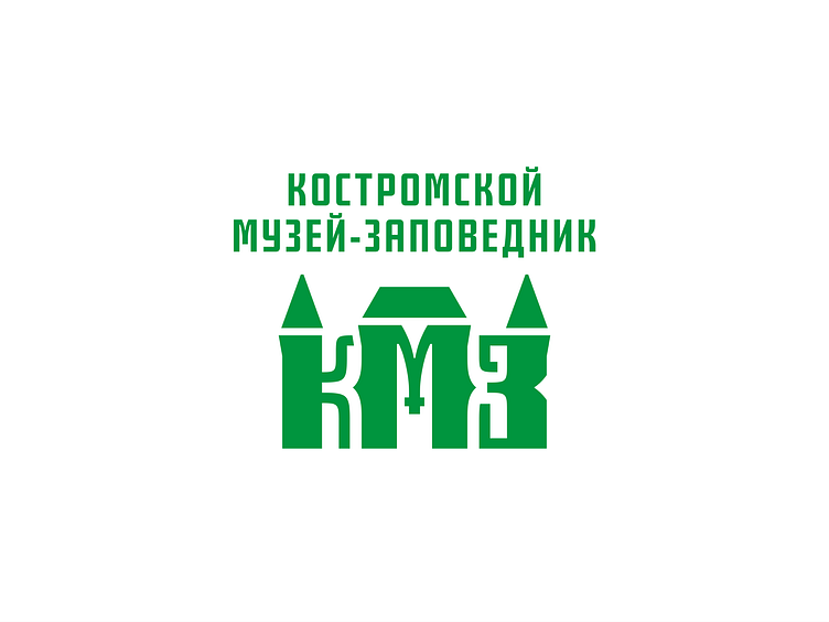
Kostroma Museum-Reserve
Hey, guys! :) It's me again with the Kostroma Museum Reserve logo revision.
I think the new typeface matches the logo mark quite well. I'm especially happy with the M. The new layout looks interesting as well.
The mark also got a little update. I decided to get rid of the triangle above the M. The middle roof is cleaner this way. The triangle roofs were too sharp for the eye, I've chamfered the corners just a bit.
That's about it. You can check out the updated project on my Behance. Peace!
abbreviation
arch
architecture
art
branding
culture
geometric
history
kmz
kostroma
logo
museum
reserve
romanov
russia
triangle
View all tags
Posted on
Aug 8, 2022
More by Nikita Lebedev View profile
Like

