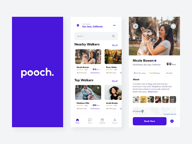
Dog Walking App - pooch.
Design Brief
Hi all, this is my first case study on the Dog Walking Application, which I created for the Dribble Product Design Course.
Background
There are many dog walking apps or pet care apps in general. My goal for this application is to make it easy and simple and help users be able to find the dog walker within a few steps.
I'm sure there will be flaws 😅, both in the technique of each process and in the results of its application. But targeting these deficits can help me understand how to improve my process overall.
Thank you so much to my mentor, Taya, who helped me with this.
Problem Statement
Dog owners spend way too much time finding a dog walker and don’t feel safe handing off their dog without some sort of qualification or recommendation.
Consider how we can help dog owners trust that their dogs are in safe hands.
Who is your user?
Dog owners & Dog walkers.
What is the problem we are trying to solve?
Help dog owners to find reliable and trustworthy dog walkers for their dogs.
What are the user's needs and pain points?
We had a FigJam session and found out current dog owners' pain points and when they need dog walkers and pet care for their dogs.
Risk & Reward
What are the risks if we don’t solve this problem now?
Idea & Validation
Do we have any initial ideas? Are they any good?
Project Goals
I aligned my goals and project requirements before starting the process.
Work Timeline
The below timeline illustrates my overall design process.
User Research
I interviewed some of my friends and family members who own dogs.
I interviewed them over video calls & phone calls using Zoom, Instagram & WhatsApp platforms.
In total, there were six participants with whom I got an opportunity to talk & gather some insights about their challenges.
Market Research
I did some research looking for similar products & compared two websites, which help me to understand the strengths and weaknesses of current competitors.
Persona
I created a user persona based on the target user group and all the information gathered from the research.
User flow
This is my user flow for my dog walking app. The user flow takes the user from their entry point through a set of steps towards a successful outcome.
Lo-Fi Wireframing
Once I organized my insights, I began to sketch. I started this process with my user flow as a guide. This allowed me to explore several concepts.
Hi-Fi Wireframing
Based on feedback from the sketch, I began to design my wireframe using Figma.
Visual Designs
After completing the wireframe, I started working on creating a mini design system for my dog walking app.
Components & Variants
To use the elements across my designs, I created a few components. They help me to create and manage consistent designs across the app.
UI Design
Based on all the User research & analysis, I created the final UI design.
Prototype & Test
I tested my prototype with friends and got positive and negative feedback. This helped me uncover opportunities to improve the overall user experience.
Feel free to check my prototype.
Outcome
The initial process helped me make the design simple and easier.
Learned new concepts such as User Flow and Card Sorting, learned the importance of stakeholder interviews and learned the importance of asking
the right questions to the users.
Many things can be improved from this case study, and it will be a lesson
for me forever.
Thank you very much for taking the time!


