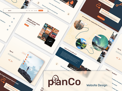
PlanCo Website Design
Hi everyone! I recently made this design for a company called planCo who specialize in planning outdoor adventures. I played a lot with imagery and balance with this design. I also wanted to use a slightly different color palette from what I would normally associate with the outdoors, but I still wanted it to feel natural. The target audience was men working in tech, so I chose a medium orange as the accent color because I find it to feel kind of techy. I chose two dark tones as well as two light tones to accompany this choice. For the dark colors, I chose a dark navy/inky blue and a warmer sepia. I went with more airy golden tones for the light colors. Let me know what you think!
More by Jordan View profile
Like
