👟 Foot Locker's Digital
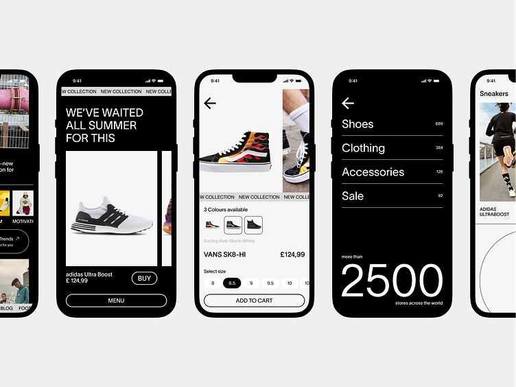
🏢 Athletic Retailer: Foot Locker, an American sportswear and footwear, boasts an online platform showing the latest fashion trends. However, the mobile experience lacked the features of its desktop version.
📱 Mobile Makeover: Enter Brightlab, a creative design agency based in Chicago. Tasked with Foot Locker's mobile app, we featured minimalism to help the user experience. Our redesign focuses on decluttering the interface and optimizing navigation, ensuring easy browsing on any device.
🎨 Contemporary Designs: At Brightlab, we specialize in transforming visuals to intuitive layouts, and our redesign for Foot Locker's brand improved user engagement. Ready to level up your brand's online presence? Partner with us for captivating designs that resonate with your audience.
Just drop us a line: [email protected]
Now you can see the mobile app, the redesign of which was made by our Brightlab design team. Minimalism has become our starting point in the design of the Foot Locker website. It helps to convey the main essence of the product and understand the navigation of the site.
Press L if you like our design and share feedback!
Visit our web and let’s start creating well-designed web products that catch the users’ attention.
Just drop us a line: [email protected]


