Veneer - Entry for logo competition

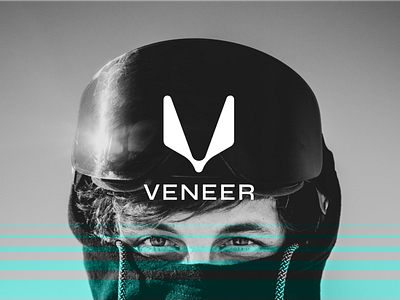
The brief challenged us to create a logo for a brand producing snowboarding goggles for young, trendy, middle-class and thrill seeking costumers. I chose the V shape as the main inspiration for the logo not only because it is the first letter of the brand's name as it also evokes movement and a rebel, iconic nature. The V thus materializes on negative space as well as on the shape itself, alluding to the eyes-nose triangle space upon which goggles rest.
The typeface is clean and sharp, true to the brand's nature.
3rd place in July's logo competition at Satori Graphics Discord server.