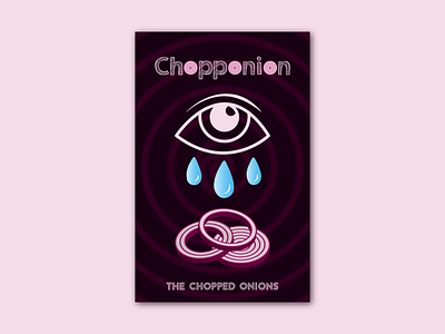
Assignment - June 2022: New Album & Band Poster Design
In this optional assignment: Applied Fundamentals, from last month (June), I used all the skills that I learned in Course 1 to create a poster for a new album by a new band. The goal is to get me to apply all that “abstract” graphic design knowledge into a “real” piece of graphic design, a piece that I can shape and control. Then, just like real graphic design, I get to put it out into the world and see people’s reactions to it!
I used my imagery from Week 1 as visual content. I used my type knowledge from Week 2 to help me set the band’s name and title. I used my color and graphic shape knowledge from Week 3 to build out the design. I used my compositional knowledge from Week 4 to compose all my elements.
• Does the poster demonstrate a clear and intended use of typography? What is working or not working in terms of type?
• Do you have any suggestions or ideas on what techniques or strategies the student could use to develop their poster further (ie. in terms of image, type, color, or composition)?
Thanks for reading!
