Brand Identity - Perennial Protocol
Creating a community-driven identity for a bleeding-edge financial product
Perennial is a protocol that makes launching synthetic perpetual swap markets as easy as inserting a few lines of code.
The Challenge
The target audience is primarily Crypto/Web3-native Developers and Traders with a relatively high tolerance for risk. They are trailblazers in their field and actively looking for their next opportunity to expand their experience, exposure, and influence in the space.
When our audience comes into contact with Perennial for the first time we want them to feel like this product is elegant in an obvious way. It should feel innovative enough to excite those looking for the “next big thing” but familiar enough to feel like something that’s been missing from their toolbox.
The value in its ease of use, should be apparent. “It just works”
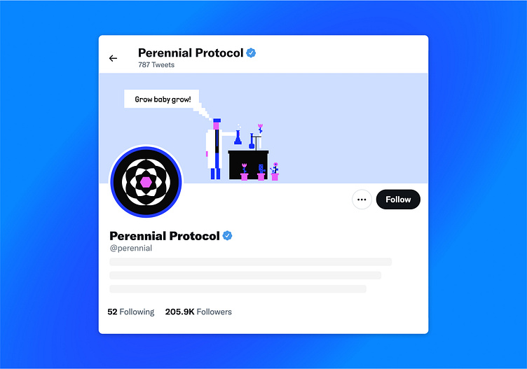
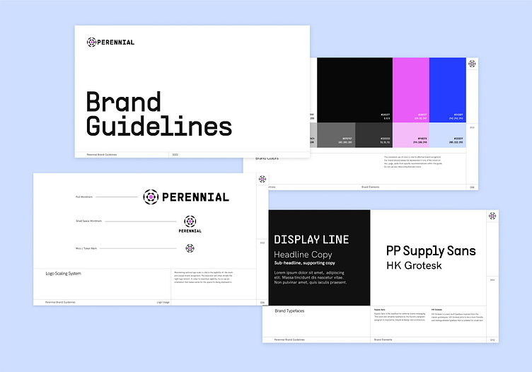
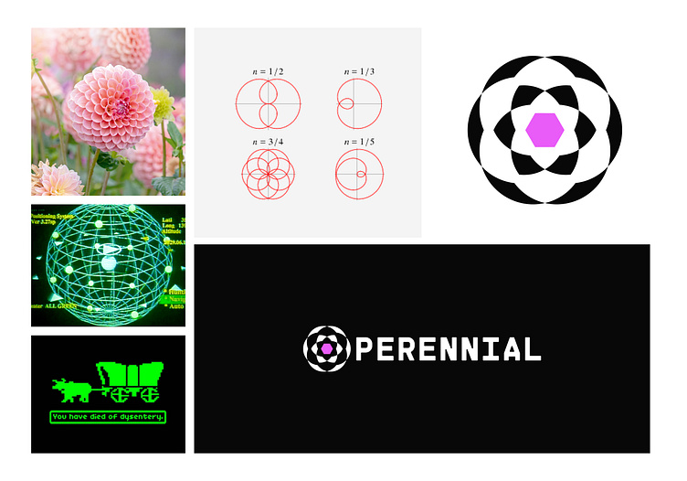
The name Perrenial is a play on words referencing the trading mechanics that the protocol is known for (perpetual swaps). The form of the Perennial mark is inspired by the geometry of a polar rose. The interplay of negative and positive space gives a nod to the name while leaning into a technical aesthetic with a balanced and logical presence.
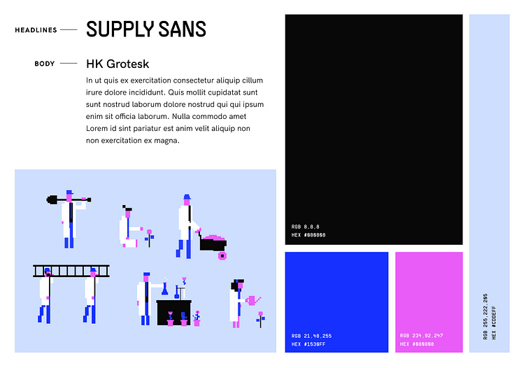
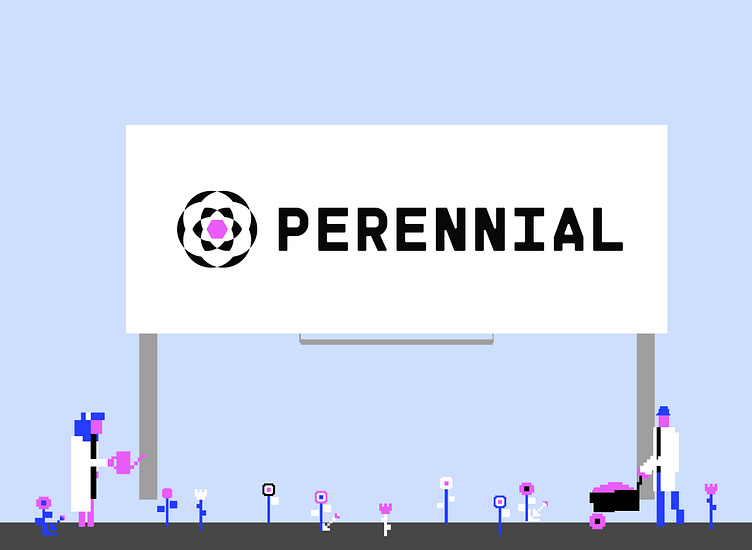
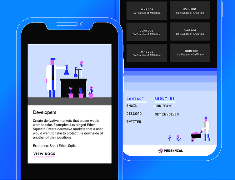
The limited color palette and 8-Bit illustrations of people in lab coats are used to maximize recognizability and provide a touch of friendly personality.