Redesigning Crowwwn — UI/UX Case study

This case study is not just going to be about redesigning crowwwn alone but also improving its experience by adding new features.
🤩 Omg! Did I hear crowwwn👑?. Excited.
Yeah, you heard it right. Crowwwn it is.
BRIEF
This case study intends to learn how they solved the problem and what we could learn from them. I took this challenge as a part to improve my design skills and try something new.
Problem Statement
To redesign the existing crowwwn page for the web platform.
The process
Let’s take a detailed look at how I used the Design Thinking methodology to solve this redesigning challenge:
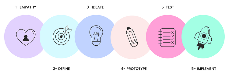
DESIGN THINKING PROCESS
E-D-I-P-T-I
EMPATHY🤍 | DEFINE🎯 | IDEATE💡 | PROTOTYPE✏ | TEST📝 | IMPLEMENT🚀
Video Presentation👀
Check out the presentation I made for the Crowwwn👑 project.
EMPATHIZE🤍
What is Crowwwn👑?
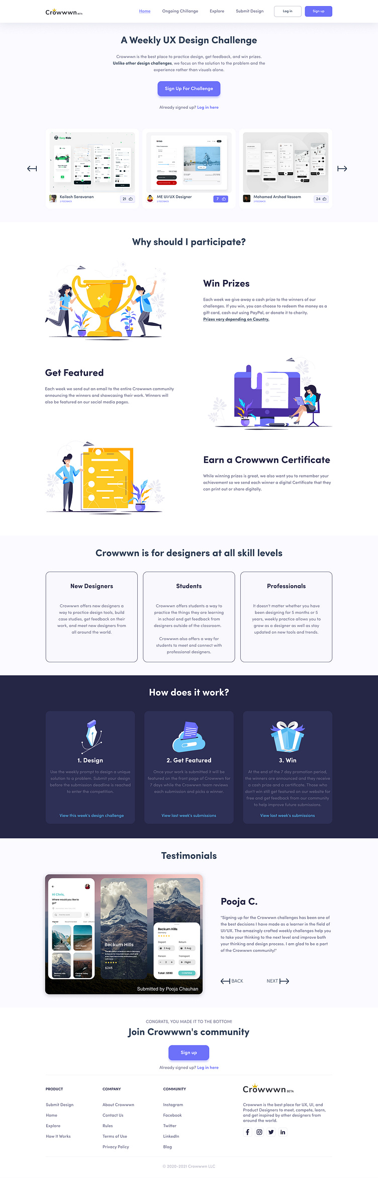
As most of you know crowwwn is a community for designers to practice, get feedback, and learn from other designers from all around the world. And creatives who get to upload their work, get feedback, explore, build an online portfolio and find job opportunities.
Crowwwn also has the best place to win prizes by taking part in weekly challenges.
Who are the users?
The users are aspirants who want to build a career in the UI/UX design field.
Why We Need Crowwwn?
Because to show our skill and learn from the same community, sometimes it also helps to earn some money.
It helps us to get updates on what is in trend in the design system and analyzes performance.
It is the most efficient way to connect with the same community.
It reduces the time for the designer to go through every individual website to get inspired, stay updated with trends and showcase their own design skills. This is why crowwwn and such websites are available out there.
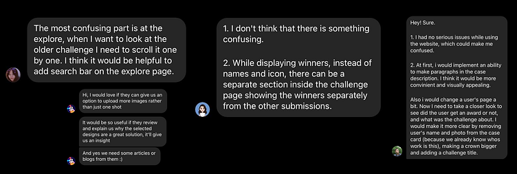
Interviews
To discover problems and identify users’ behaviors with the existing crowwwn website, I conducted some user interviews.
Here’s what the crowwwn users said:
Why redesign?
As I looked at the website and I am a part of the crowwwn community I didn’t find it visually good and lots of missing features that can be added to enhance the user experience and user interface it. It needed a redesign or you can say touchup.
Second, when I started to look around the user feedback, I was pretty much sure that users are not happy with the current website look and may more things.
Goals
✔ Good: To make it visually appealing
✔ Understandable: Current use of UI elements and proper information architecture.
✔Scannable: To make sure important key points are highlighted to catch the eye.
✔ Helpful: Design should be made in such a way that it tells us in which area we are excelling or doing good.
DEFINE🎯
Identifying Problems & their Solutions
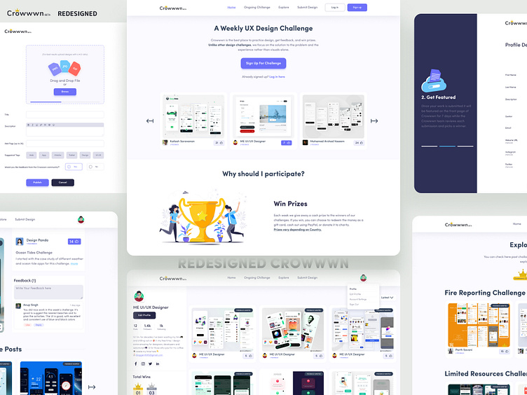
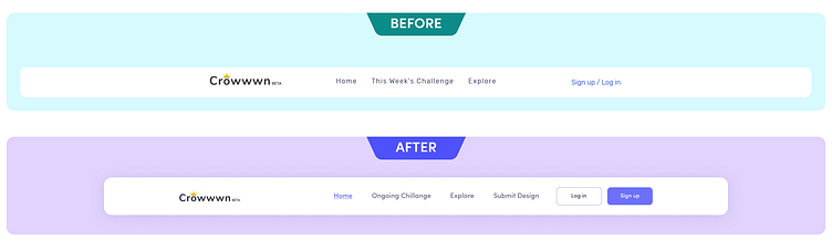
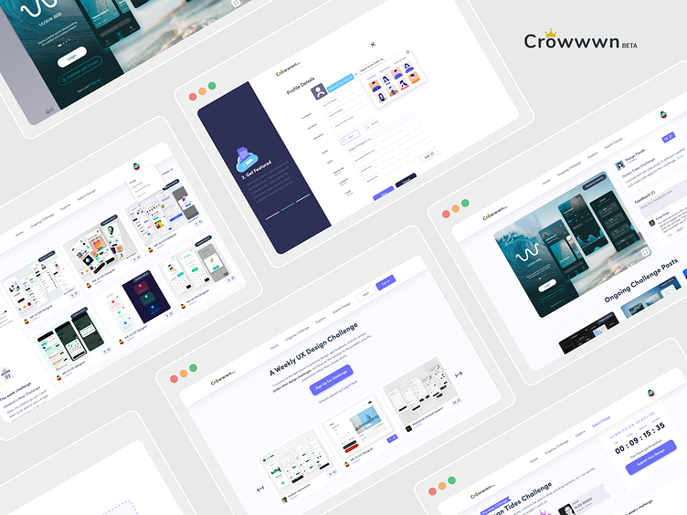
Before & After
Below I’m going to show you the key problems that I and some of my designer friends noted from the existing crowwwn site.
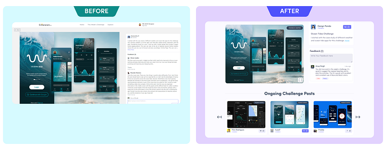
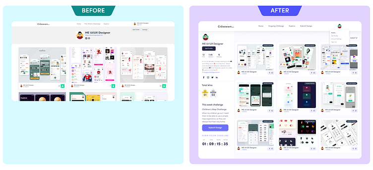
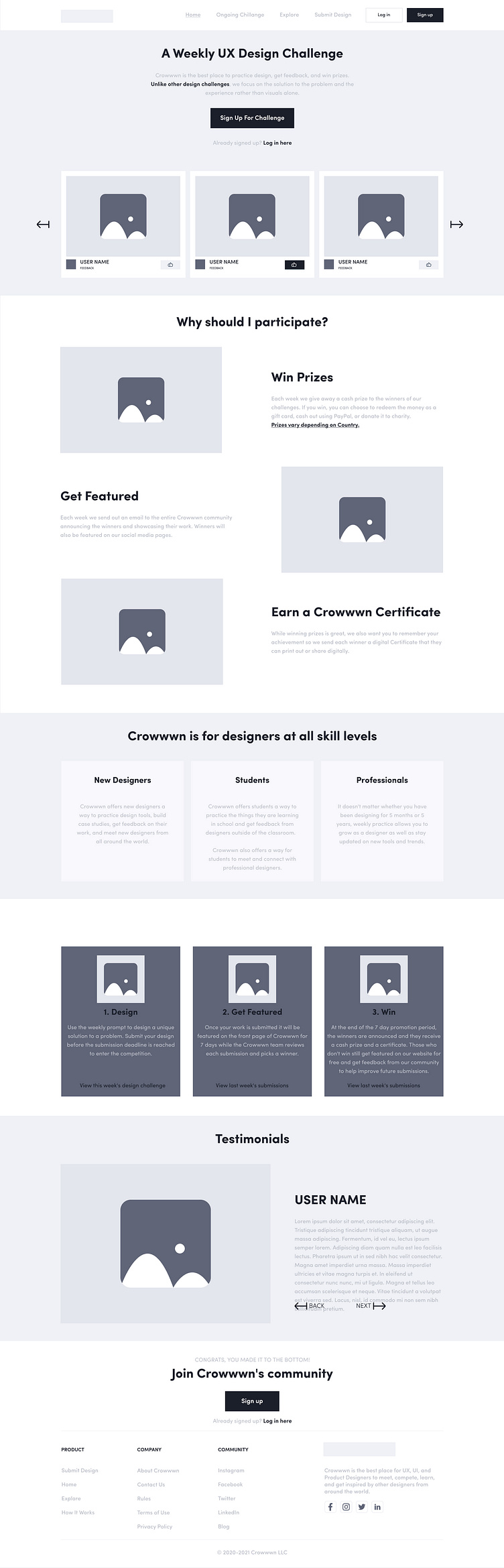
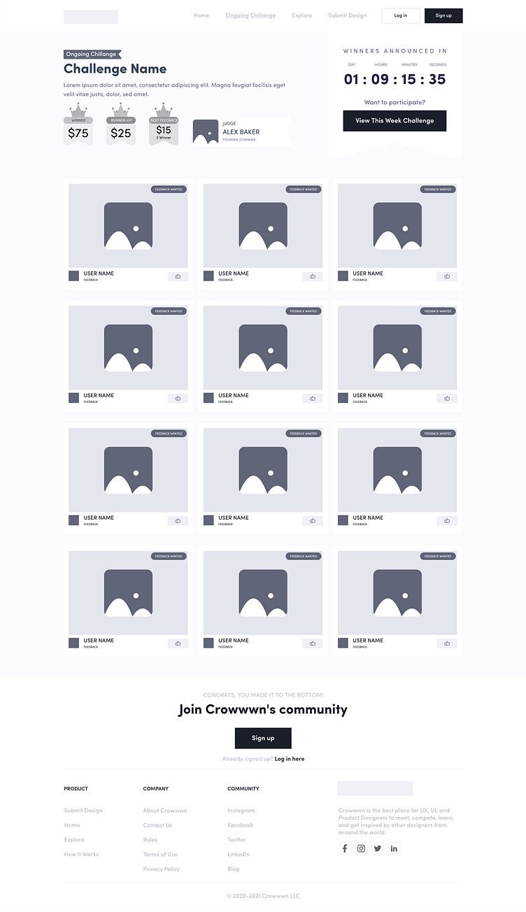
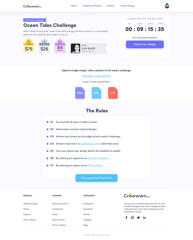
Menu — While navigating to the menu on crowwwn’s platform, there is a problem finding the right menu to see the current (Ongoing Challenge) UX challenge.
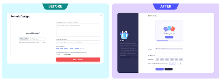
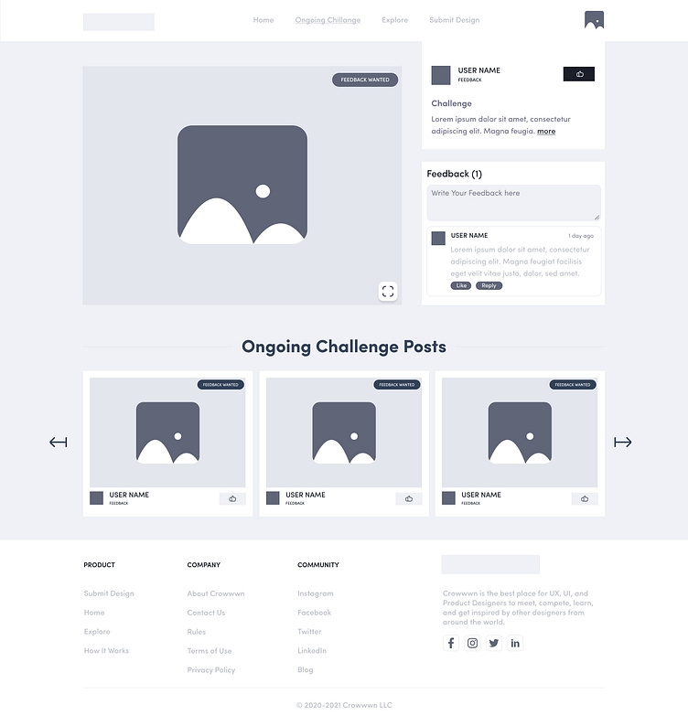
Editor — Writing a description while uploading the design on crowwwn’s platform is a good way to tell the viewers about the idea, process and inspiration.
It helps the viewer to understand the design more vividly. However, the lack of formatting options cause some issues to represent the description of design. There’s a need for bullet options, bold, italics, underline, & paragraph break to represent the details.
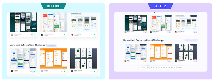
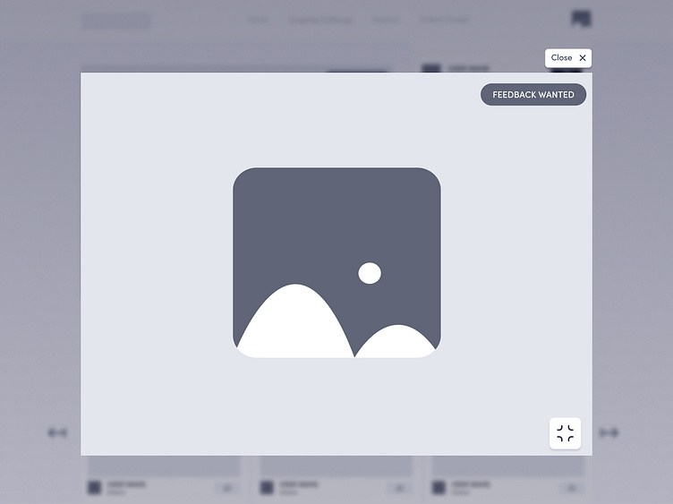
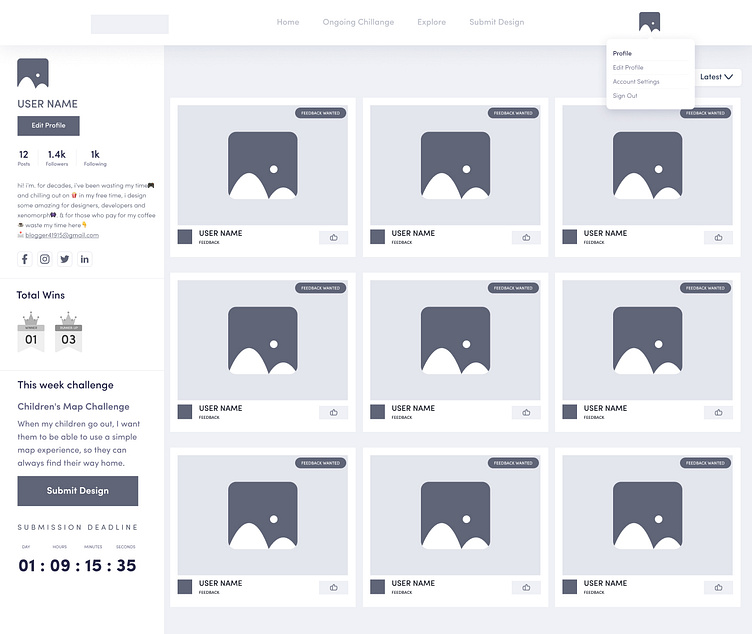
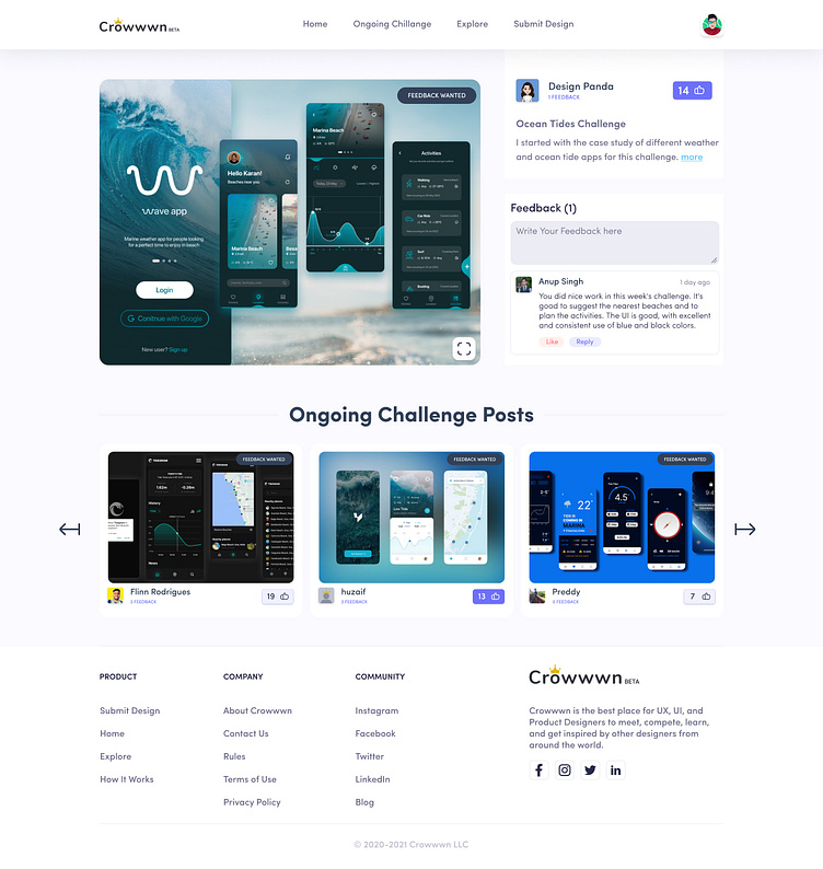
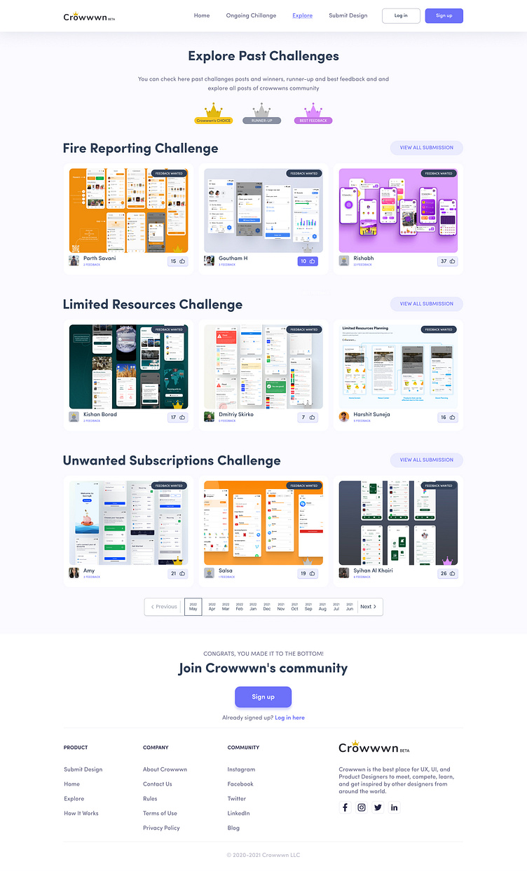
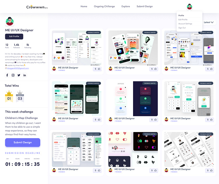
Relevant Suggestion — Showing relevant submitted designs as shown in the image here will help the visitors to stay engaged on the site as well as it will help them to compare the relevant designs. So, adding this feature will also enhance the user experience as well as the UI will be more appealing.
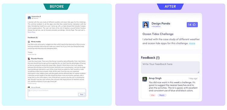
Feedback — Each post contains several comments and replies but the reply and original comments appear the same. It could be enhanced by simply altering the UI design of the comment section.
Like option is also an important feature that should be there in Crowwwn’s comment section. Because if someone likes the design and the given comment then they can show the agreement via clicking on the like button.
Everyone doesn’t like to spend time on writing and giving their opinion but, they can spend a few seconds on showing whether they agree with someone or not. Like option could be a good feature that will allow viewers to show the agreement.
Zoom Shorts — In the uploaded UI there are lots of tiny text that isn’t visible in a normal view on crowwwn. Sometimes, it troubles a viewer to understand the purpose of design. However, with the help of ZOOM features like Dribbble, or any online designing website have.
Viewers can easily see the uploaded design clearly and can share their opinion based on their judgements.
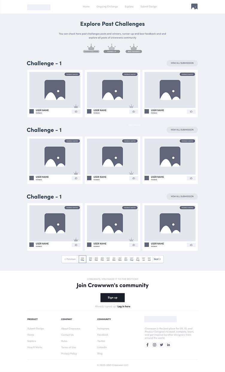
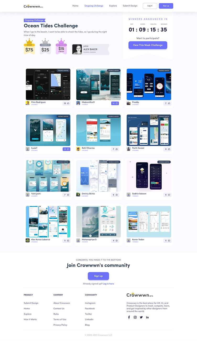
Pagination — Pagination is also an important part of the “past design explore page.” Since, crowwwn’s platform offers weekly challenges, viewers should have access to the filter that can help them to easily navigate to the design month wise.
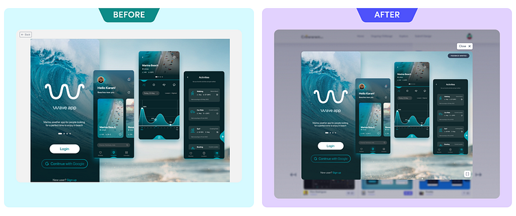
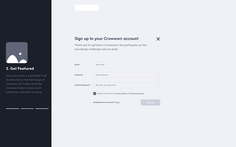
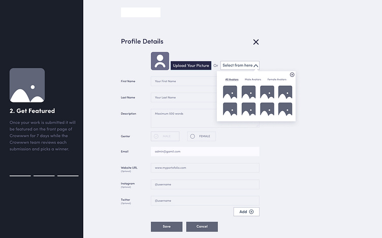
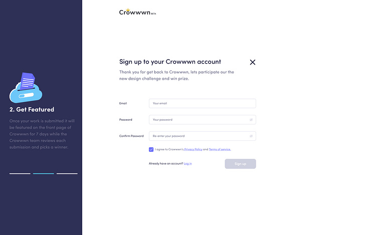
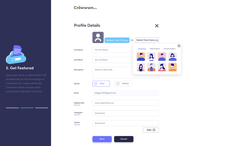
Profile — A designer’s profile works as a portfolio for them. They can share their profile link to others to show their skills and works. Therefore, the profile section on the crowwwn’s platform should be designed in a manner that will help the users to showcase their achievements, & all the statistics related to their works such as Followers, Total posts, & an appealing bio.
After identifying the problems, I noted down the contents and start my ideation.
IDEATE💡
So keeping in mind that I had to redesign crowwwn. I made a list of points that looked important to the user.
Who is affected by the problem?
What is the problem?
Where does this problem occur?
When does the problem occur?
Why does the problem occur?
Why is the problem important?
Analysis
I went through several designing website. Collected images of few real web design inspiration like Dribbble, Behance, Uplabs etc. and made a list of patterns and noted the similarities and differences they have. Patterns such as colors, icons, boxes, spacing, tabs, filters, text links, and layouts.
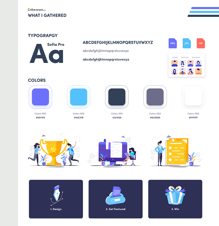
What I gathered:
Key information at the top of the page.
Usage of vectors.
Minimal usage of colors.
Bold Texts.
PROTOTYPE✏
USER FLOW
There are many ways to use an app or website and user flows are visual representation of those avenues. This can be done by sketching on sheet of papers or by making it digital.
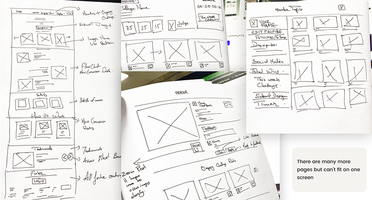
Low-Fi WIREFRAMES
Now it’s time to start ideating by sketching the new features I want to add to existing website. I gathered all the sketches and by brainstorming, I have chosen the best way to enhance the user experience of crowwwn website.
Mid-Fi PROTOTYPE
Here comes our Mid-Fi Prototype of the website, adding actual details so I can feel what actual design look and feel so I can move to my final product design, using Figma.
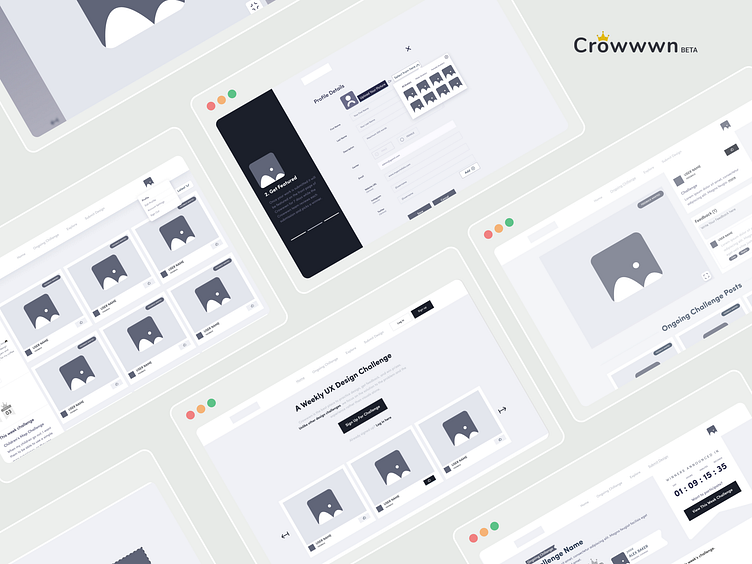
High-Fi PROTOTYPE
Then my next step of my design process was to create a final design by taking deep into UI/UX implementation in crowwwn, and by adding actual details some visual effects so that it matches more the final product, using Figma.
TEST📝
Usability Test:
Then mt next design process was to usability tests.
From these usability tests, we could gather several user feedbacks :
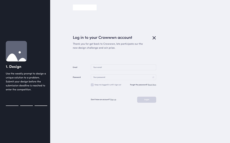
After revamping the navigation bar, switching between home page and ongoing challenge page became easy.
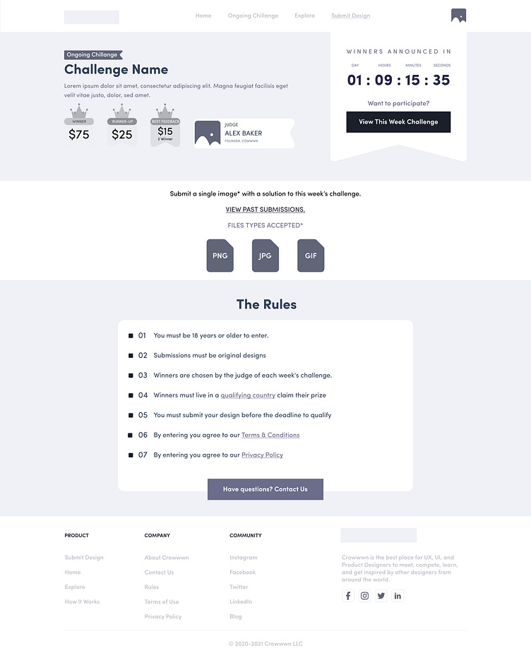
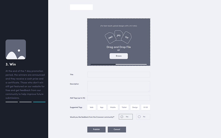
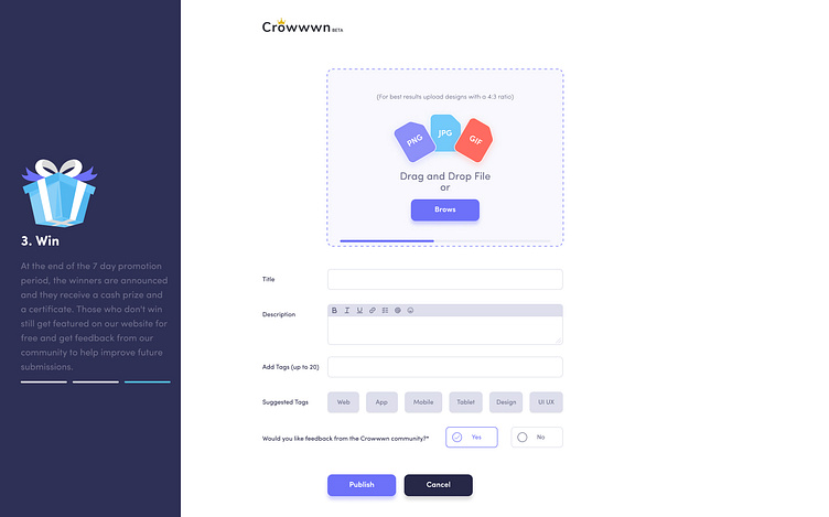
Crowwwn’s platform now contains visual instructions on which kind of design file they can upload such as GIF, PNG, JPG.
After improving the editing section in the new design of crowwwn, it shows a user can now easily add links and break the line, add hyperlink etc.
In order to make the comment section more appealing and user friendly, this revamped UI looks more suitable. Since, it is clear and crisp.
ZOOM features, It’s really required because designers are sharing various screenshots of design in a single frame that looks to Messy without looking them zoomed in. The new design considers this feature consciously.
Now it’s easy to explore past design through new pagination
Now designers can share their profile with others as a portfolio. And easy access to their total wins on crowwwn and filter their profile etc..
These UI/UX enhancement will help crowwwn to support the user flow and eliminate general pain points.
CONCLUSION🚀
I started this case study to discover the difficulty I was facing with Crowwwn’s platform. I am one of the early users of this platform and since then I was noticing the need for improvement and my fellow designer friends used to think the same.
However, crowwwn’s own team has done many improvements by themselves till now in crowwwn’s site. But the changes I have tried to counter through this case study should definitely be beneficial for Crowwwn’s website and its all users.
My whole idea was to focus on user experiences more and redesign the crowwwn’s platform so that new users will not face the same difficulty as we all have to face.
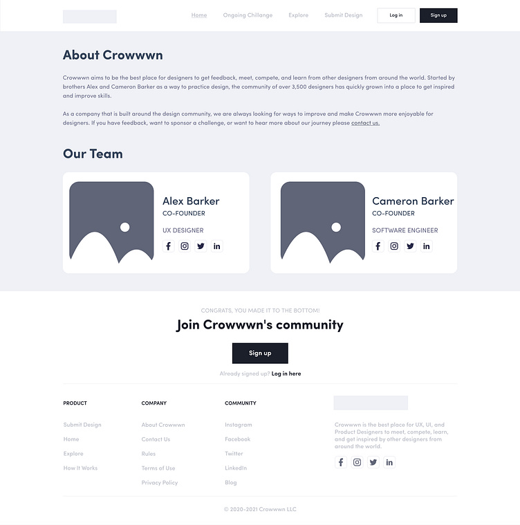
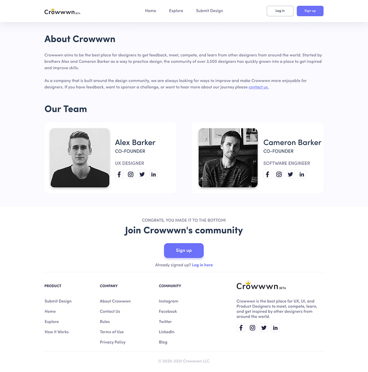
I am thankful to the Alex Barker, founder of crowwwn’s for developing so adorable and helpful UX designer community.
Also due to this platform, I started my very first UX case study that helped me to learn and do various enhancement in my own skills.
I enjoyed every step of this design thinking process and hopefully you will find worth reading it.
Thank you for giving your valuable time and interest in this case study or Crowwwn’s redesign
See you soon in my next UI/UX challenges & case study!
Signing off, ME UI/UX Designer😂
Don't forget to follow me if you don't to miss other shots.
Please show a little bit of appreciation! & show some ❤ and follow me.
FOLLOW ME ON MY SOCIAL PROFILE
UPLABS | DRIBBBLE | INSTAGRAM | TWITTER | BEHANCE |
PINTEREST | LINKEDIN | FACEBOOK | MEDIUM |
I'm available for the freelance project - 👽[email protected]
Enjoy!