Kanan Baking Co Packaging and Branding Design

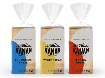
Ready to level up in the grocery retail space, this family-owned bakery needed an update to their branding and packaging that would align with their new name and strategy. The challenge was to embrace Kanan’s unique artisanal-quality focus, but with an accessible design appropriate for their mid-range price point.
With a playful hand-drawn logo, friendly colors, and clean modern layouts, the resulting packaging design soars above bread shelf competitors, yet feels approachable for grocery store customers.
Design: Audrey Green
Creative Direction: Design Womb; Nicole LaFave
Brand Messaging and Copy: Design Womb; Zach Golden