Itsapop Packaging and Branding Design

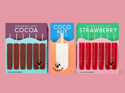
As demand grew in Chicago for their healthy gourmet pops, this brand needed a visual refresh to help take them beyond their bicycle cart origins and into grocery stores. It was important for the new brand identity and packaging to appeal to health-conscious customers, while remaining playful and grounded in the childhood joy of eating a juicy summer popsicle. With its minimal and modern design focused around typography, color, and photography, the resulting packaging delivered a unique and elevated brand positioning compared to its frozen food aisle competitors.
Design: Audrey Green
Creative Direction: Design Womb; Nicole LaFave
Brand Messaging and Copy: Design Womb; Zach Golden