Glucose Trend Graph

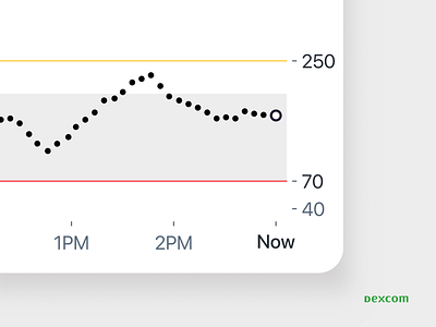
Most recent Estimated Glucose Value (EGV) sensor reading is represented as a white dot on the far right side of the graph in the Trend Graph.
The yellow line represents a user's high-threshold and the red line represents a user's low-threshold.