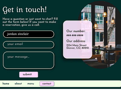
Aroma Contact Page
Hi! The final section in Aroma's website is their contact page. Aroma is a fictional restaurant specializing in steaks and soups. I decided to use a layered effect with another image of the restaurant (from unsplash). I put the general contact info in a card hovering over the image. For the contact form, I decided to have simple outlined input boxes with rounded corners to give it a sophisticated, yet fun, appearance. I decided that the focused state would have a black fill in the input box. Also, this was unplanned, but I like the way the 'G' looks in "Get in touch". That came from the font I chose. It was a Google font called Kurale if anyone is interested. Overall, I really like the way the website design came out as a whole! What do you think?
