Koike Saké

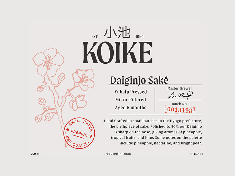
The overarching challenge with any label project is how to create something that stands out from its competitors. This couldn’t be less apparent with the sake industry, as most labels look too similar to discern. Traditional sake labels tend to be minimal in design, fixating on the brand name, sake type, and location. With most sake labels choosing to stick to comfortable styling choices, we challenged ourselves to create a label that conveyed a familiar heritage tone with a modern twist. We opted for a minimal utilitarian layout focusing heavily on the information, which allowed us to display information not commonly shared, such as sake type, fermentation processes, and tasting notes.

