Type Set Match: 10 Timeframes, No. 3
This shot was originally a rebound of one of Tim Brown's Type Set Match entries. I've increased the resolution of the image so that it holds up better with today's Dribbble guidelines.
---
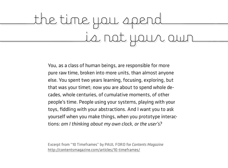
I thought Paul Ford's article highlighted the contrast between our innately fluid—and human—perception of time and the relentlessly mechanical nature of (actual) time. I tried attempted to elucidate this tension with my choice of typefaaces:
Process Type's Fig Script for display—an upright and geometric script face that indicts the rigidity of the pixel grid while still working within it. I chose to add depth with a subtle drop shadow to avoid the headline feeling too lifeless.
Process Type's Klavika for text—a squarish, technical sans-serif with humanist characteristics. According to the foundry's website: "a cross of humanist and geometric influences with allegiances to neither." I chose to use stylistic alternates in order to take advantage of a more straightforward lowercase g.
A dissonant modular scale (18px @ 1:1.875) was used to establish hierarchies and proportions.