VR Development
Home page visuals
The web project for WE/AR Studio agency I used to work at. It was tremendous work of redesigning the whole website, including more than 10 unique pages.
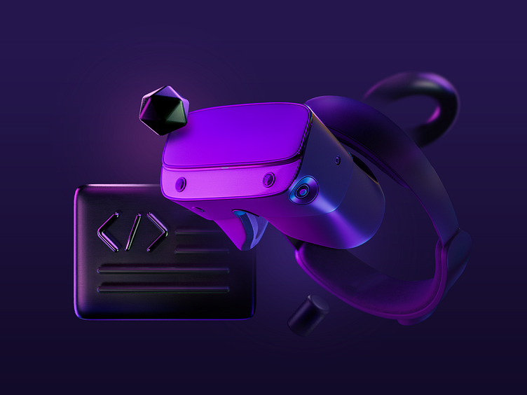
Besides web design work, I also challenged myself into creating a collection of 3D visuals that will bring the high-tech look & feel and match the Extended Reality field that the agency is specializing in.
The idea was to keep consistency with the WE/AR Studio brand across all visual references. Those were dark theme color palettes, with violet as a primary color, and acid pink as supplementary.
For the Hero section, there was an alternative image. Overall, the idea was to show VR technology, along with the development process. Besides that, it was important to emphasise that it is commercial agency after all, that applies research & analytics into each project. Thus for the 2nd visual you may see some stats metaphor, looking glass & coins.

